
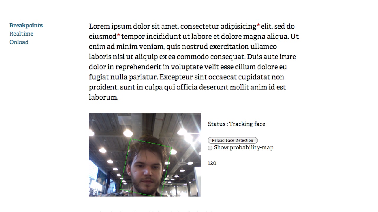
Web designer Marko Dugonjić created an experimental site in which the type changes sizes based on how close your face is to the computer. When you’re right up next to the screen, it’s nice and small, and as you move further away, the type gets bigger so it’s easier to see. Genius!
It’s a little clunky for now (it takes a few seconds to scan your face when you load the page, for example), but one could easily imagine this being used for practical purposes (or art!) down the road.
