
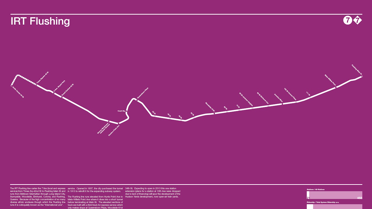
As designer Andrew Lynch points out, though traditional Subway maps are extraordinarily useful, in the strictest sense, many aren’t really maps at all: proportions are skewed in favor of readability, so that the distance between two stops on the map may not truly reflect their actual proximity.
With a passion for accuracy and an eye for minimal aesthetics, Lynch created a series of new, true-to-scale maps–one for each of New York’s nine lines. Each poster separates one line from its context within the city, presenting it against a bold, colored field, accompanied by written information.
“This series of posters tries to flip the original rational for clean design on its head,” writes Lynch on Kickstarter. ” Instead of creating a map showing the routes of each line abstracted to fit into a small map each poster shows just one train line by itself, stripped away from its context, with a description and statistics provided. Why do it this way? I wanted to show the viewer something they see everyday but in a completely new, almost unrecognizable way; the way it actually looks.”
$25 dollars gets you the poster of your choice, assuming the project is funded. Lynch is currently $600 short of his goal, with 46 hours of funding to go.
