
Gilad Lotan of I-Data has published an enlightening and thorough analysis of how social media channels and online publications spread coverage of the conflict in Gaza. It illustrates the pathways through which we’re served biased material, based on our user preferences and whichever social media bubble we already occupy.
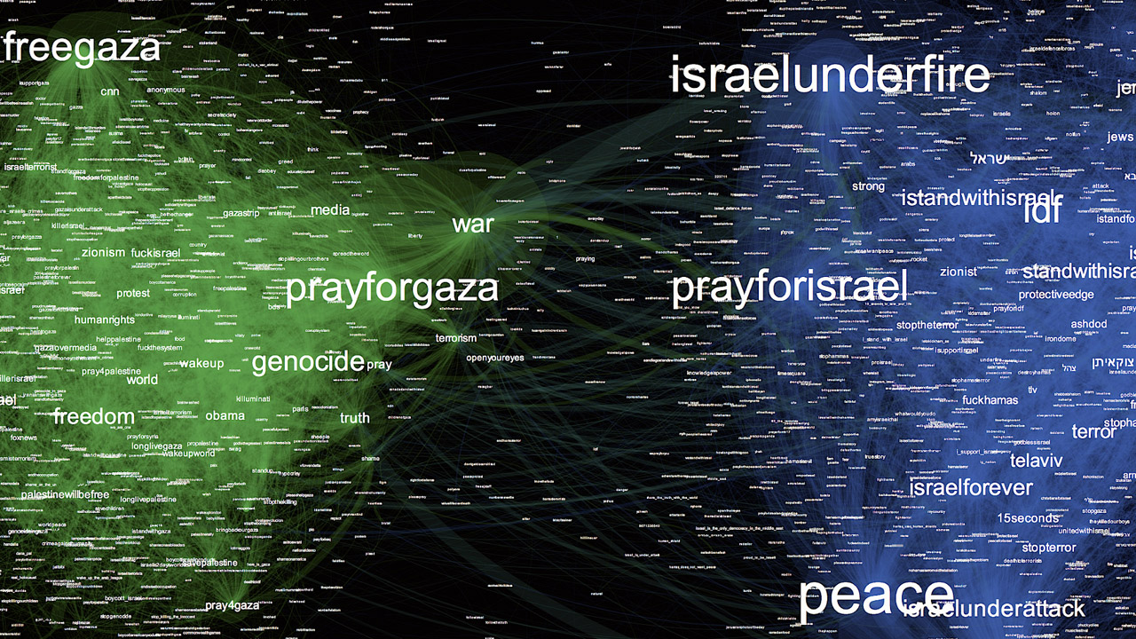
The article features massive infographics like the one above, which shows the “co-occurence of hashtags on Insragram posts.” A larger tag depicts frequency; proximity of tags the graph represents instances that these tags have appeared together — #prayforisrael and #prayforpalestine are the most popular and far apart.
Along with a breakdown of how various publications choose to highlight or completely omit potentially polarizing details of reality (like the bombing of U.N. schools), Lotan also addresses the specifics of social media platforms which are responsible for self-affirming news and meme delivery. For example, pro-IDF internet users veraciously use Facebook to distribute “buzzfeed-style attention-grabbing images” and “funny” memes, as well as propaganda by omission. StandWithUs, an international non-profit organization dedicated to “informing the public about Israel and combating extremism and anti-Semitism” has 413,000 likes. It did not mention the U.N. incident.
Lotan also explains Twitter:
The graph below represents Twitter accounts responding to a different incident at the UNWRA school in Beit Hanoun between July 25th and 30th. It is still unclear who is to blame for firing at the school, although someone clearly learned their Google SEO tricks (click here to see who comes up first on Google search).
Nodes are Twitter handles, and their connections represents who follow relationships. The larger a node, the higher its centrality, the more followed that account is within this group. The closer together two nodes, the more connections they share. Different colors represent communities, effectively regions that display significant levels of connectivity; nodes of the same color are much more inter-connected compared to the rest of the graph.

Lotan succinctly explains the issue, placing the blame on pre-determined biases:
Not only is there much more media produced, but it is coming at us at a faster pace, from many more sources. … the landscape is much more nuanced, and highly personalized. We construct a representation of our interest by choosing to follow or like specific pages. The more we engage with certain type of content, the more similar content is made visible in our feeds.
If you’re rooting for Israel, you might have seen videos of rocket launches by Hamas adjacent to Shifa Hospital. Alternatively, if you’re pro-Palestinian, you might have seen the following report on an alleged IDF sniper who admitted (on Instagram) to murdering 13 Gazan children. Israelis and their proponents are likely to see IDF videos such as this one detailing arms and tunnels found within mosques passed around in their social media feeds, while Palestinian groups are likely to pass around images displaying the sheer destruction caused by IDF forces to Gazan mosques. One side sees videos of rockets intercepted in the Tel-Aviv skies, and other sees the lethal aftermath of a missile attack on a Gazan neighborhood.
The better we get at modeling user preferences, the more accurately we construct recommendation engines that fully capture user attention. In a way, we are building personalized propaganda engines that feed users content which makes them feel good and throws away the uncomfortable bits.
Lotan suggests supporting Ha’aretz, a well-positioned and helpful resource which is struggling to find a core audience, for obvious reasons, as well as donating to 972mag.com. His article does not mention the darker corner of dark net — emails. So, no, I don’t know where your dad’s horrible hasbara chain emails are coming from. (Infographics: I-Data)

