Tag: Charts
Using the same FOIL request that gave us information on every taxi ride from 2013, I Quant NY‘s Ben Wellington bring us some more helpful data analysis. Behold, the best and worst times of the day for traffic in New York. Wellington found that, strangely, there isn’t a real rush hour in the city. Instead, the average speed […]
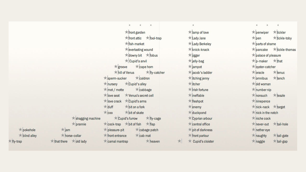
In the late 1880s, people called vaginas “horse-collars” and penises “love truncheons.” If the penis was big, however, they might call it a “kidney-wiper,” and if it was erect, “bit of stiff.” How do I know? These excellent, astoundingly detailed interactive timelines (spotted by our friends at Nerdcore) of the things we called our naughty […]

To create these maps, data visualization specialist Olivier H. Beauchesne took to Wikipedia. Taking advantage of the site’s optional geotagging feature, which allows you to associate a specific latitude and longitude to any article–the New Museum’s entry could be linked to the Bowery, for example–Beauchesne first mapped every article on Wikipedia, then did searches for specific […]