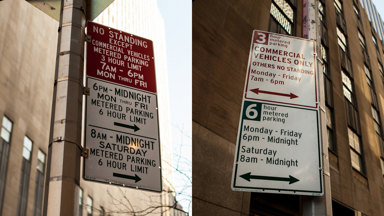
Drivers looking to park their vehicles in New York City won’t need a local fixer or translator to figure out what the regulations are because the DOT finally made a good sign-related decision. All of the parking signs have been redesigned, making them easier to read and more importantly, to comprehend. The newly formatted signs will all have white backgrounds with only two color choices for fonts: red or green. Twitter may have also played a role, as hinted by the official press release:
The new signs reduce the number of characters needed to explain the rules from 250 to about 140, making the sign appear less visually cluttered while reducing five-foot-high signs by about a foot.
#Smart! Now stop renaming shit, so we can be friends again.
(Photos: Aymann Ismail/ANIMALNewYork)


