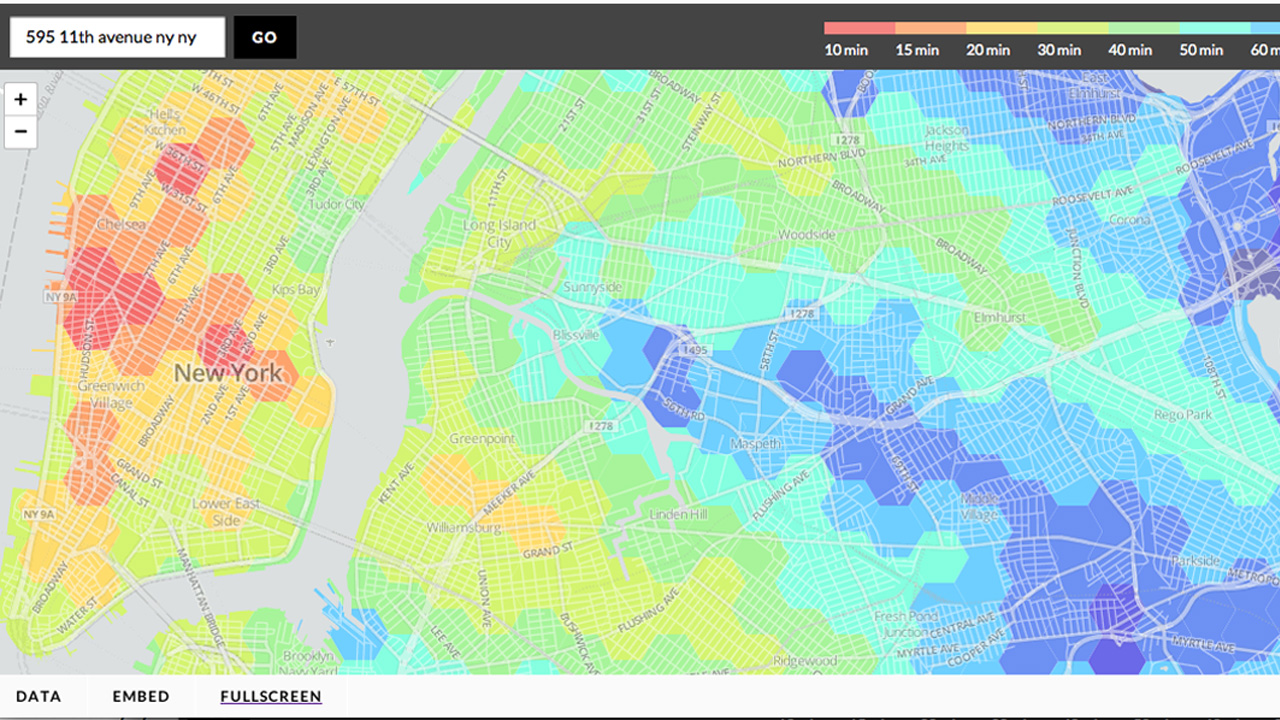
Do you tend to plan your daily outings based exclusively on travel time via public transit from Point A to Point B? Do you feel stifled when required to provide a specific destination by websites like Hop Stop and Google Maps? Do you just love being able to rearrange pretty colors with a random click of the mouse? Are you stoned right now?
If you answered “yes” to any of these questions, then you’re going to love Transit Time NYC — a new interactive map from WNYC. It uses a color-coding system to show you how long it will take you to get from where you are to everywhere else in the city. The data incorporates walking and subway travel time, and is based on MTA weekday schedules. Just click where you are on the map and let the colors do the rest!


