Beautiful Maps Of Human Movement Through Major Cities
July 2, 2014 | Sophie Weiner
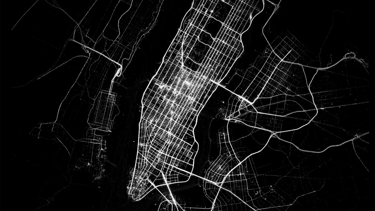
The activity tracker app Human has created a set of beautiful maps that show the movement of a city in a day period.
These luminescent maps were created with the data collected from people using the app as they moved around major cities by walking, running, biking and motorized transport. The maps fade in from black to outline the busiest routes or most walked streets. Cities like Copenhagen light up much more for biking, while New York’s walking map quickly sprawls out in all directions. Their interactive website lets you see a breakdown of each city’s transportation habits. Check out a few of the New York maps along with their gorgeous video below.
Eric Fisher, a man who turns human movement into art through his unique maps, has created an interactive world map that shows how tourists and locals occupy major cities via their tweets. For "Tourists & Locals," Fisher mapped geo-tagged tweets between September 2011 and May 2013 and ascribed a blue…
Well, this is depressing. You know what's depicted in the image above, don't you? I'll give you a minute. It's New York City. Easy, right? That crowded, finger-like thing near the top is definitely Manhattan (check out Central Park in the middle if you had any doubts), and from there,…
As impressive as they are invasive, Google Maps are about to get a lot more detailed. The company has introduced 3D imaging to Google Maps and Google Earth in San Francisco and New York, with more cities getting rendered in 2015. TechCrunch reports that the change comes from "better cameras…