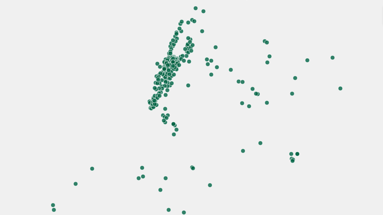
Well, this is depressing. You know what’s depicted in the image above, don’t you? I’ll give you a minute.
It’s New York City. Easy, right? That crowded, finger-like thing near the top is definitely Manhattan (check out Central Park in the middle if you had any doubts), and from there, it’s easy to infer that the spread of dots around it makes up Brooklyn and Queens. But what do those dots represent? Housing prices? Population density? Jobs?
They’re Starbucks. Slate created the brilliant, disheartening diagram, as well as maps for a whole bunch of other cities, as part of a quiz to guess the town based on the locations of the world’s most ubiquitous coffee shop. It turns out it’s pretty easy. Look at a few of the maps (spoiler alert) in the gallery.


