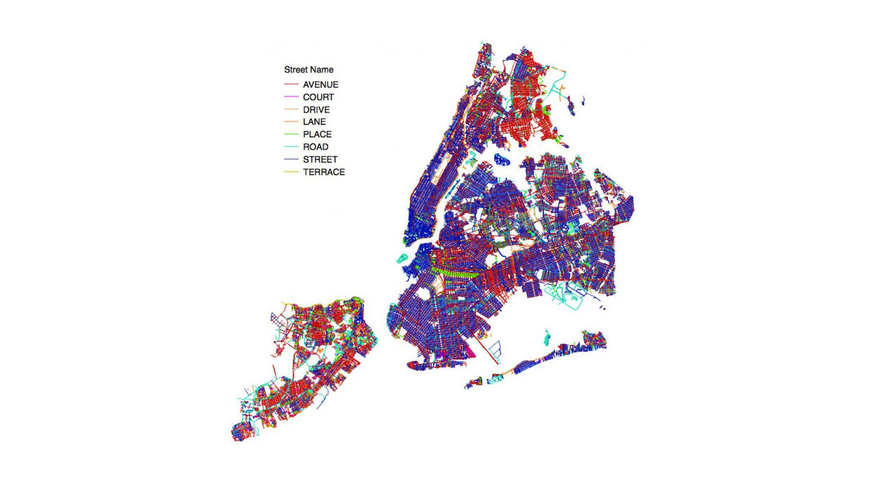
The colorful map above charts every street in New York City by its “street suffix”: if it’s a street, it’s blue; if it’s an avenue, it’s red; if it’s a place, it’s green; if it’s a road, it’s teal, and so on. It reveals a few obvious and not-so-obvious truths about the city’s patchwork of pavement.
Of course, Manhattan is mostly streets, with a few big avenues running up and down the island. Brooklyn is street-heavy as well, though Bed Stuy and East New York have a lot of avenues, and there’s a distinct band of places through Prospect Heights and Crown Heights. The Bronx and Staten Island, on the other hand, are dominated by avenues, and Queens has more roads than any other borough.
According to Ben Wellington of I Quant NY, the blogger who created the maps, the naming differences probably have to do with how the city was planned:
Outside of Manhattan, the different naming conventions seem to always be at different angles from one another, which probably indicates separate developments. That also explains why Staten Island is the most patch-worked. And it shows why Manhattan is the most standardized. It is easy to see where the commissioner’s plan kicked in to create the grid.
See the whole map along with detailed analysis from Wellington here.


