Tag: Infographic
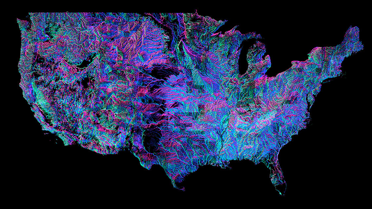
Andrew Hill of data-visualisation firm Vizzuality has put together this insane interactive map for you to peruse the United States complex system of rivers and he’s color-coded it out in that distinct black light poster style. The colors are based on the direction each river flows. New Scientist explains: “There are 18 distinct colours around the compass,” […]

In the past few years, there has been a tidal shift in how America feels about weed. More and more people are steadily getting behind the idea of ending Prohibition II, and despite a historically low turnout during the midterm elections, two more states plus Washington, D.C., voted to legalize cannabis for recreational use. What’s […]

About five and a half million people ride the subway on an average weekday. These people lose a lot of stuff. When a lost item is retrieved by an MTA employee, it’s added to a list that’s published online and updated hourly. Using this data, FiveThirtyEight created infographics of the most common and strangest items on […]
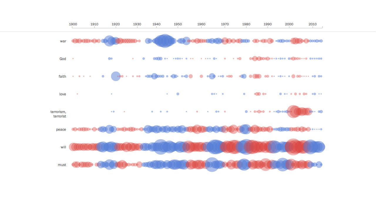
There have been 116 State of the Union addresses since the 1900s. The Washington Post has a nifty interactive infographic illustrating word usage frequency, in neat little circles. See how the 20 presidents used words. See “communism” get replaced by “terrorism” (108 times in 2001 from Bush Jr) and the stream of “America”/”American” steadily getting […]
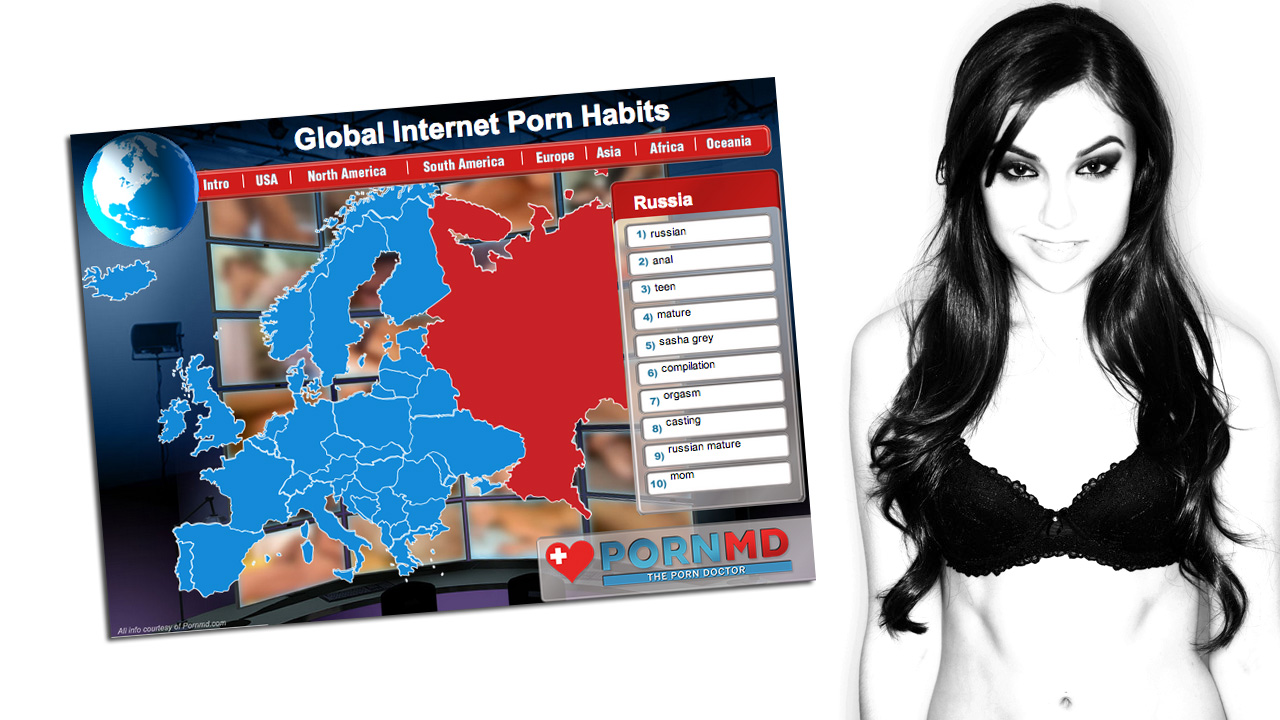
This is probably the most amazing, psychologically-telling infographic you will ever see. About porn. Porn MD presents: The top porn-related searches over a 6 month time period, broken down by country and, in the US, by state. We already knew that everyone loved porn, but who knew that Syrians were so turned on by “feet […]
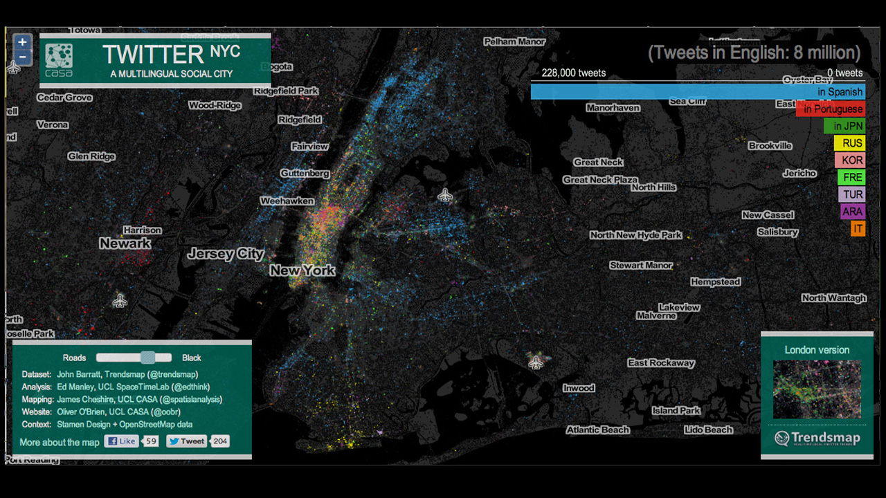
Aren’t you loving Twitter’s ability to turn your life into a statistic? Yes? So, here’s an interactive map that the Gothamist found, depicting a vast diversity of languages tweeted throughout New York City, as detected by Google Translate. See the density of each language is visualized by neighborhood: English (grey), Spanish (second-most-tweeted language: blue), Portuguese (red), etc. The resulting infographic […]