Tag: map
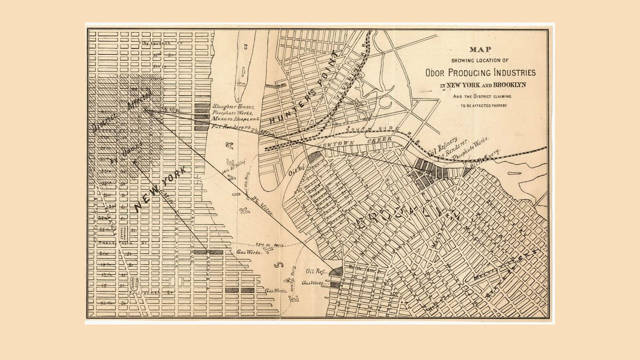
CityLab has obtained a circa-1870 “stench map,” which shows the locations of what were called “offensive trades,” or industries that made the city stink. 19th century medical science believed that bad smells and tainted air caused diseases like cholera. The map was created by the New York Metropolitan Board of Health and can be found […]
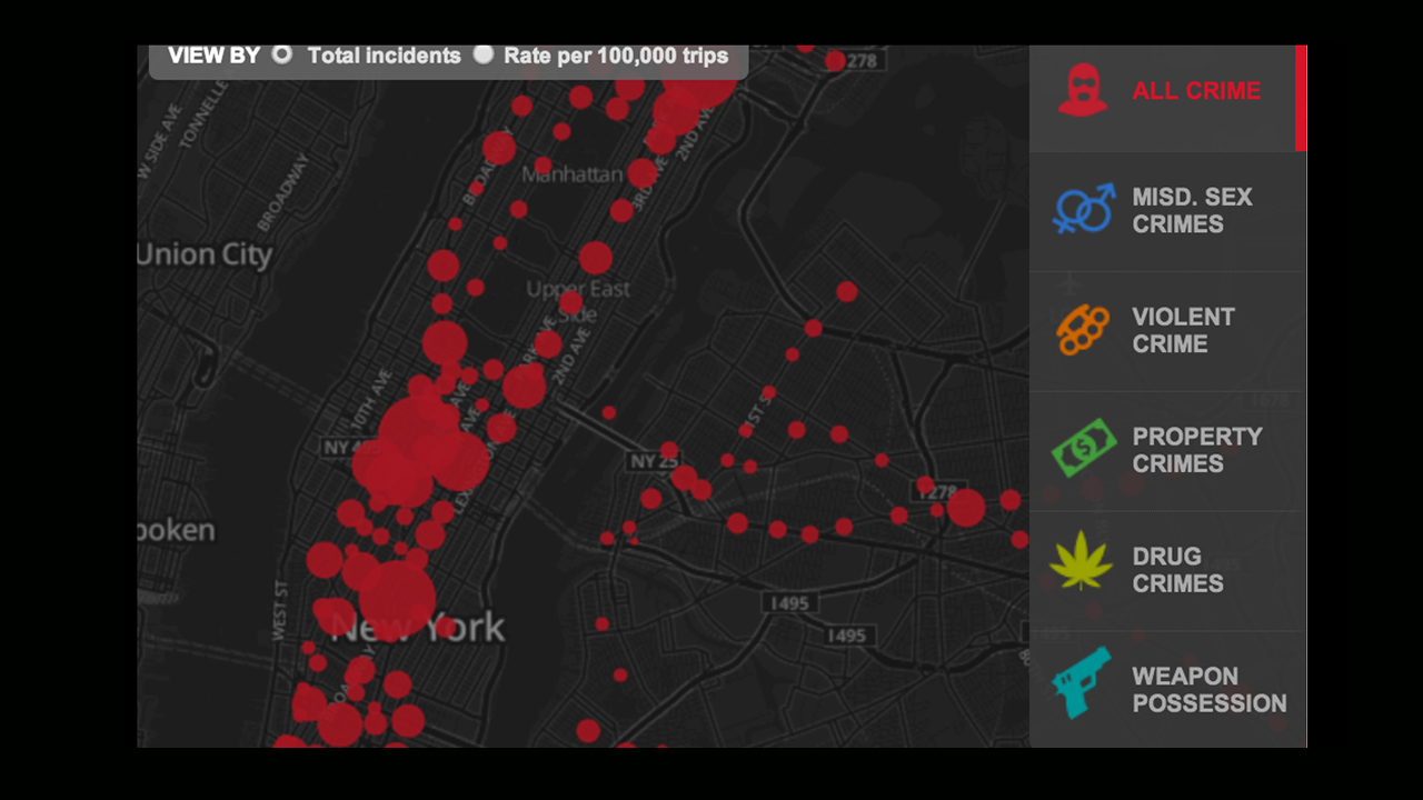
Compiled by the New York Daily News, here’s an interactive map of the various crimes committed on the subway, based on NYPD data recorded between July 2008 and June 2013, obtained via a Freedom of Information Law request. According to the stats, the annual number of crimes decreased 12% from 2009 to 2012. It’s a nice looking map […]
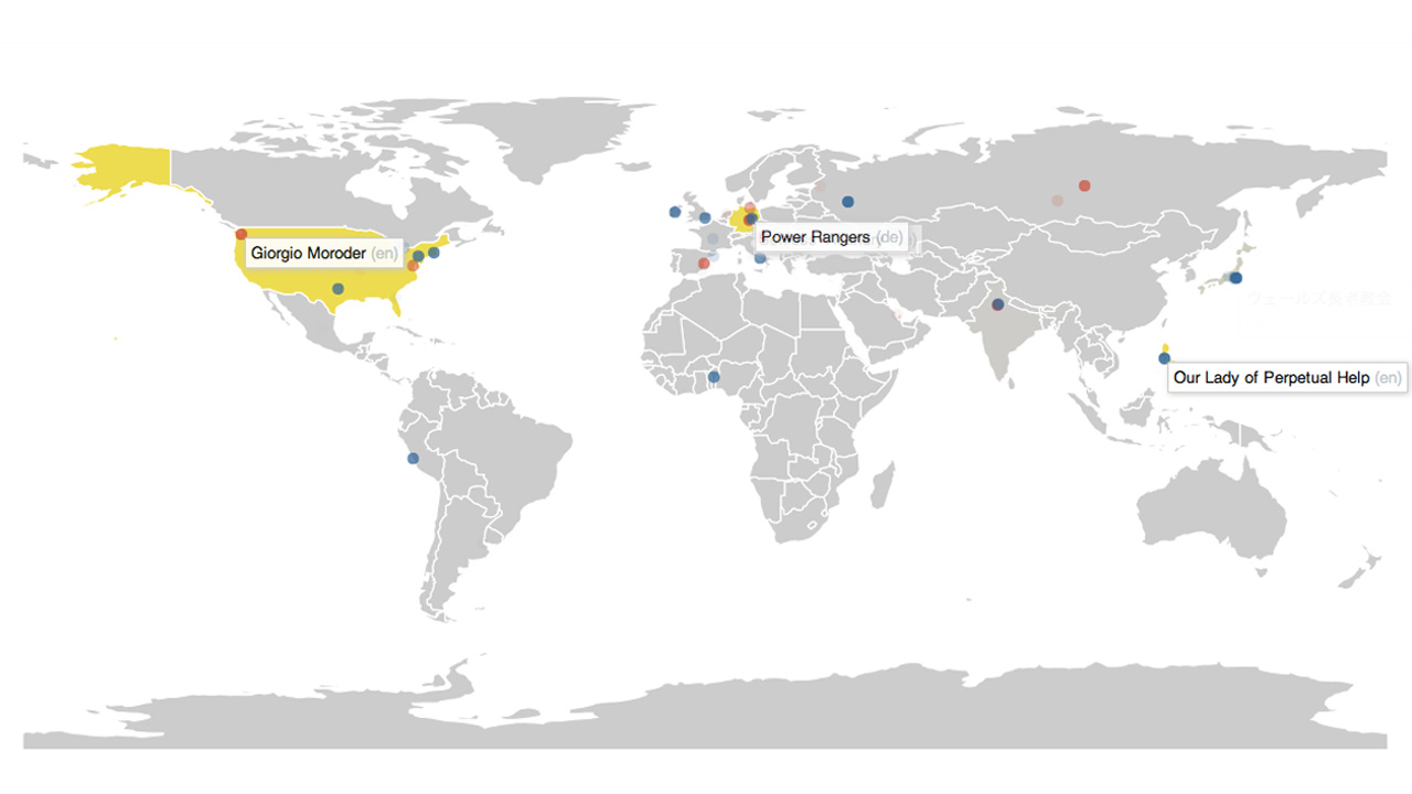
With so many relying on Wikipedia as the definitive source of “truth” on EVERYTHING nowadays, we often have to remind ourselves that the site’s content is constantly being altered, erased, and reinvented by anyone who feels like it. Now you can watch this reality manipulation in real-time with this interactive map created by California-based duo Stephen LaPorte and […]

First day of spring? Sure, whatever. (Free) Macaron Day NYC? HELL. YES. What, you might ask, is a macaron? It’s a French confectionary tradition, a dainty cookie with a soft, almond-based shell with a creamy ganache center. Basically, it’s how the French do Oreos. Yum. Today, bakers all over NYC will be dishing out these […]
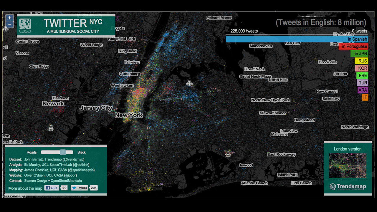
Aren’t you loving Twitter’s ability to turn your life into a statistic? Yes? So, here’s an interactive map that the Gothamist found, depicting a vast diversity of languages tweeted throughout New York City, as detected by Google Translate. See the density of each language is visualized by neighborhood: English (grey), Spanish (second-most-tweeted language: blue), Portuguese (red), etc. The resulting infographic […]