Everything Gmail Knows About You in One Interactive Infographic
July 8, 2013 | Andy Cush
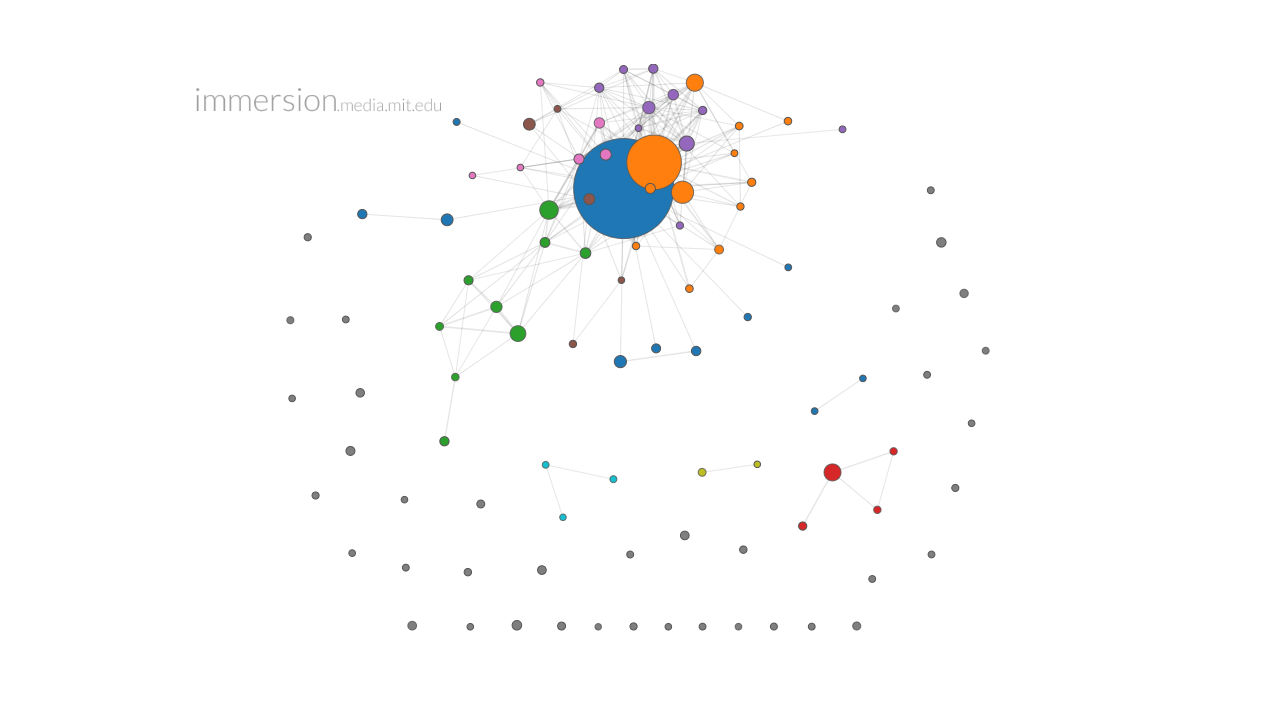
Wondering what exactly the metadata Google hands over to the NSA every day is comprised of? Here you go. Created by the MIT Media Lab, Immersion collects all data from your account regarding to and from whom emails were sent, then creates an interactive infographic mapping out all of your connections. That’s the graph for my year-old ANIMAL email account above; Bucky is the big blue dot, Marina is the smaller orange one.
As you can see, you can paint a pretty vivid picture of someone without even looking into the contents of their emails. Brian Fung at the Atlantic, whose email account is much older than mine, was able to map the kinds of associates in his life–family, college friends, friends from D.C.–based on the colors assigned to them by Immersion.
And yes, creating an infographic does require you to give up your information to MIT, but wisely, the app gives you the option to wipe the data from its servers when you’re done.
Created by the developers Pitch Interactive, this animated infographic plots every U.S. drone strike and all associated casualties. In just a few seconds, a flurry of strikes and deaths appear, beginning in 2004 and drastically upticking in 2008-2009, when Pervez Musharraf resigned as president of Pakistan and President Obama took…
Nothing says outrage at the creeping surveillance state like an adorable terrier wearing human clothes with leaked NSA documents printed on them. Big Data Pawn Shop, an art project/clothing label wants you to be able to make a fashion STATEMENT with the documents that Edward Snowden risked his life to smuggle…
A piece of code used by the NSA to label online "extremists" has been uncovered for the first time. The German public television network ARD reported that the popular encryption service Tor, which is based in Germany, was one of the entities that had become a target for the NSA's…