
Tag: Data Visualization
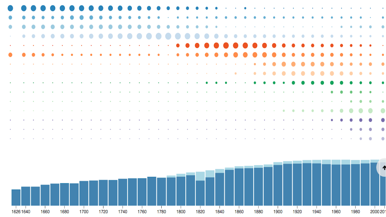
New York has always been a city of immigrants, but those immigrants have come from different places at different times, as Metrocosm’s new interactive visualization shows. Max Galka, who previously analyzed NYC filming locations, crunched Census records and other historical documents to get sense of where people emigrated from all the way back to when […]
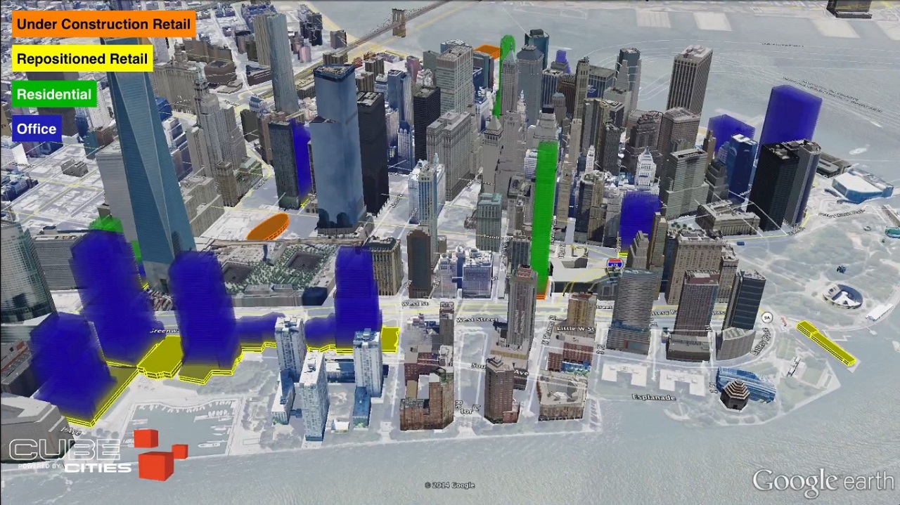
Cube Cities, a floor-level visualization platform designed to communicate building information, has just released a video showing the massive retail construction and renovation projects currently going on in Lower Manhattan. The report detailing the projects includes five under construction properties and 18 projects with new retail coming from repositioned space. Watch the video to see […]

“The Largest Vocabulary in Hip Hop,” a data visualization project by Matthew Daniels that’s been making waves since it made the front page of Reddit over the weekend, is interesting for a moment. Quantitative analysis is trendy, and so is rap music, so why not combine the two? One, because using statistics to glean anything […]
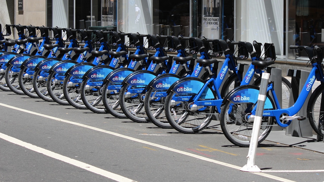
At first glance, the video below seems to show a thriving enterprise. Using Citi Bike’s openly available rider data, Jeff Ferzoco and Sarah Kaufman of NYU’s Rudin Center visualized two days in the life of the cash-strapped bike share program: over September 17 and 18 — two 60-degree, non-rainy days — we see 75,000 trips happening […]
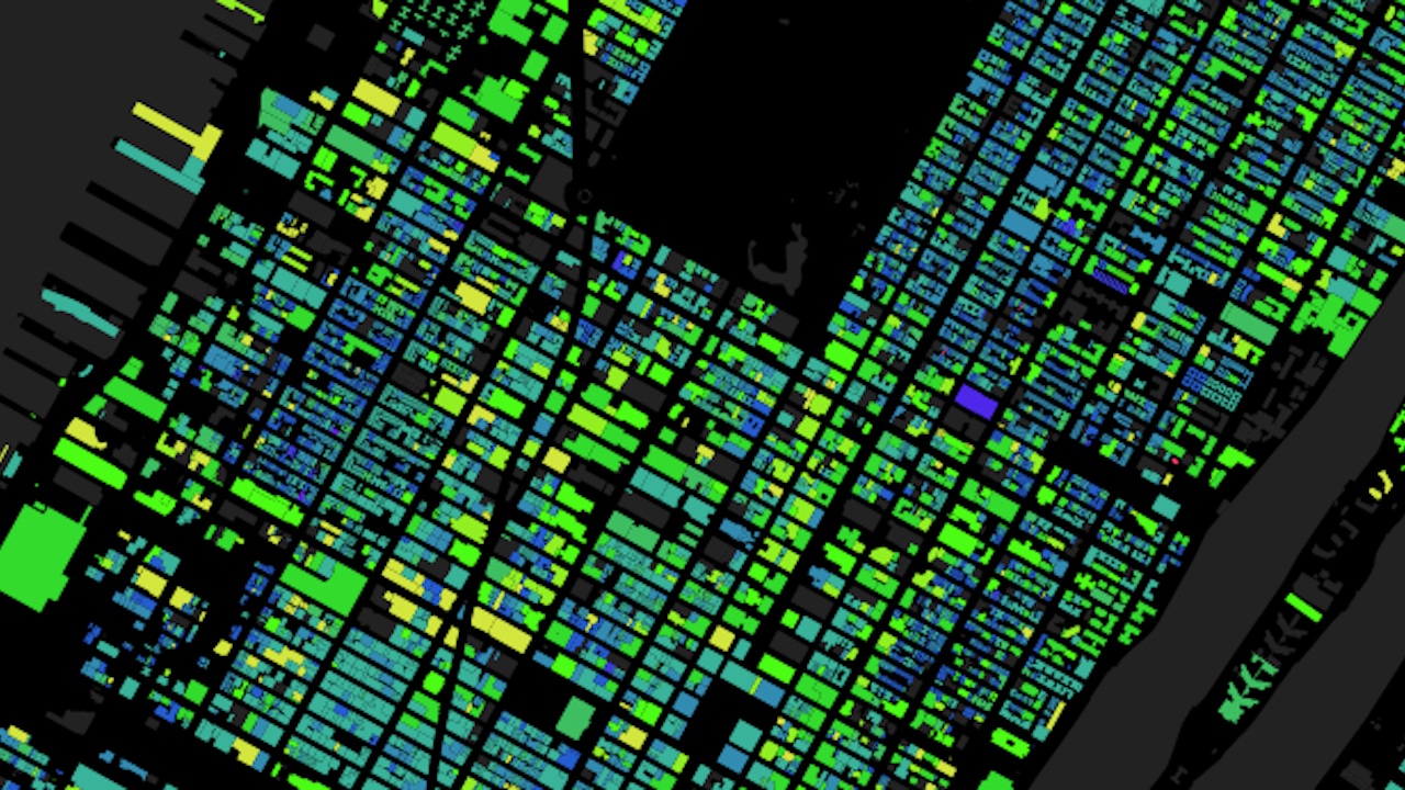
Here’s a beautiful map of most of NYC’s buildings, with age represented as color. Pink is on the early end of the spectrum, with buildings dating back to the 1830s, and yellow mark’s the city’s most recently-constructed buildings, with everything in between in shades of purple, blue, and green. Go and mess around a little […]
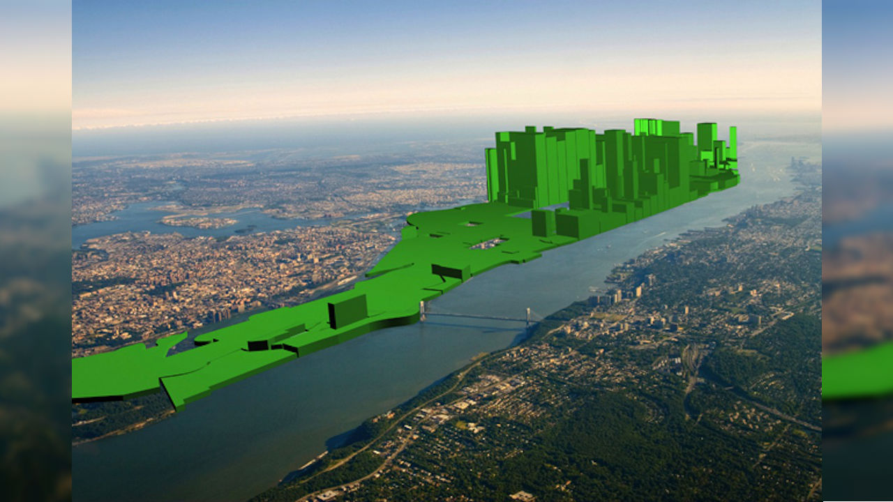
A new set of images by artist Nickolay Lamm imagines a New York City in which wealth is mapped directly onto the skyline. That, the higher the average net worth of an area is, the taller its buildings become. The results are striking, if not entirely surprising. On Lamm’s maps, the Upper East and West […]
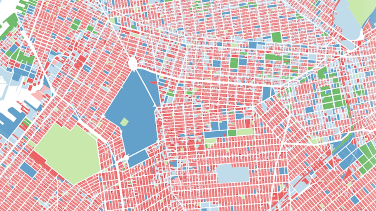
Recently, the city released a massive bundle of data about every lot of property in the five boroughs. Naturally, an intrepid data visualizer has already implemented it into a series of beautiful, informative interactive maps. Andrew Hill created the PLUTO Data Tour, which uses the data to look at things like the tallest walk-up in […]
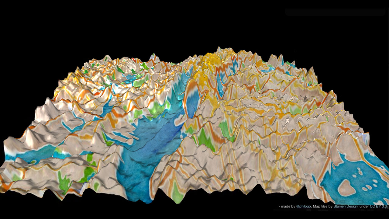
Elevation levels? Latitude? Who cares! Now you can learn the lay of the land based on Twitter activity. Andes is a topographical visualization of geo-located tweets and their frequencies — in New York City (above), San Francisco, and Istanbul. Created by data visualization scientist Nicholas Garcia Belmonte, the 3D-interactive maps depict Twitter usage as towering peaks — the […]

Pagan sacrifice! Violent flailing! SEX! When Igor Stravinsky The Rite of Spring ballet premiered at the Théâtre des Champs-Élysées in Paris 100 years ago today, there were fist fights in the audience. Indignant critics limped on home, cradling their jolted nervous systems. There is so much going on in this piece. Now, you can see it in Stephen Malinowski‘s beautiful visualization […]

Reddit is huge, almost unfathomably so. To a lurker like myself, it can be difficult to understand the inner workings and connections beyond a few big subreddits, like AdviceAnimals, IAmA, and, uh, NSFW Science. Thanksfully, redditor sharkbait784 created this interactive data visualization, which maps the connections between subs based on the number of times each sub […]


 @Zimernyc #nycgraffiti #nycstr


 @mikeraz_

 Warning: If you’re a foreign tourist plan


 : @danwitzstreetart


 #freights


