Tag: visualization
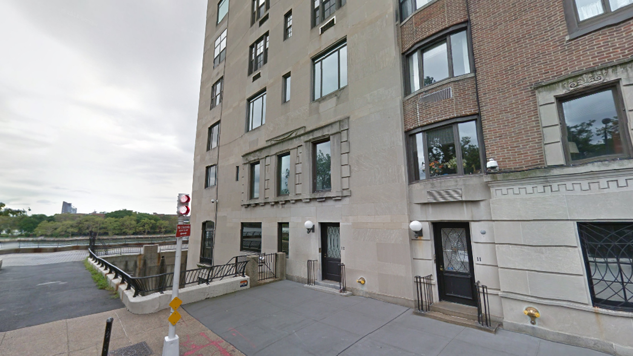
A penthouse at the top of 10 Gracie Square. Ben Wellington, the intrepid data quantifier/visualizer of I Quant NY, has merged publicly accessible information from the MTA Subway Station Entrance data set and city lot directory PLUTO to discover it. The building, located at the end of 84th street at the FDR Drive, is 0.8 miles away along the grid to the nearest […]
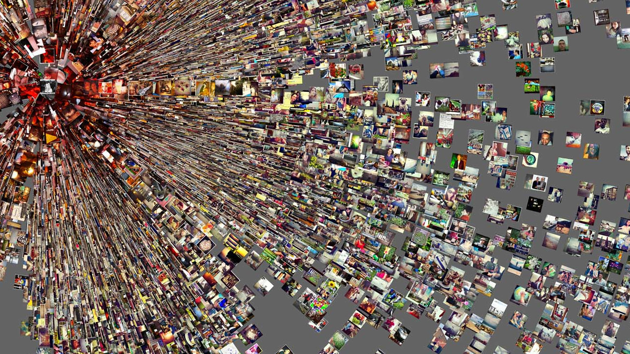
Phototrails is a new research project that uses simple media visualization techniques for exploring patterns and trends found in photos shared on Instagram. A joint venture between the University of Pittsburgh, The California Institute for Telecommunication and Information, and the Graduate Center at CUNY is “seeking to map our city-specific behavior by looking at the thousands of images that pour in […]

Facebook Stories is a San Fransisco-based project that invites the internet to create something “extraordinary” from that treasure trove of unrelenting, banal social media over-sharing. Their latest project Beatmap uses data collected from song sharing apps that integrate with Facebook Open Graph to map out the ebb and flow of music popularity across our country. Inspired by “old-school graphic visualizers,” […]
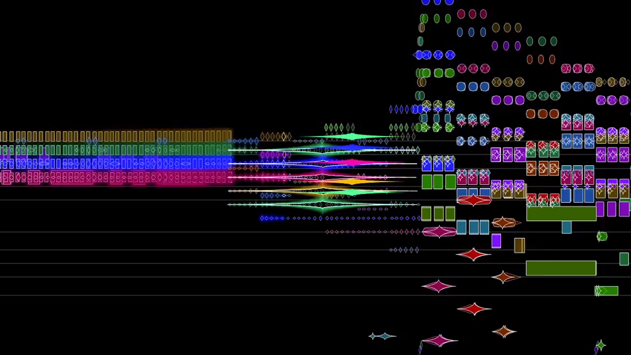
Pagan sacrifice! Violent flailing! SEX! When Igor Stravinsky The Rite of Spring ballet premiered at the Théâtre des Champs-Élysées in Paris 100 years ago today, there were fist fights in the audience. Indignant critics limped on home, cradling their jolted nervous systems. There is so much going on in this piece. Now, you can see it in Stephen Malinowski‘s beautiful visualization […]