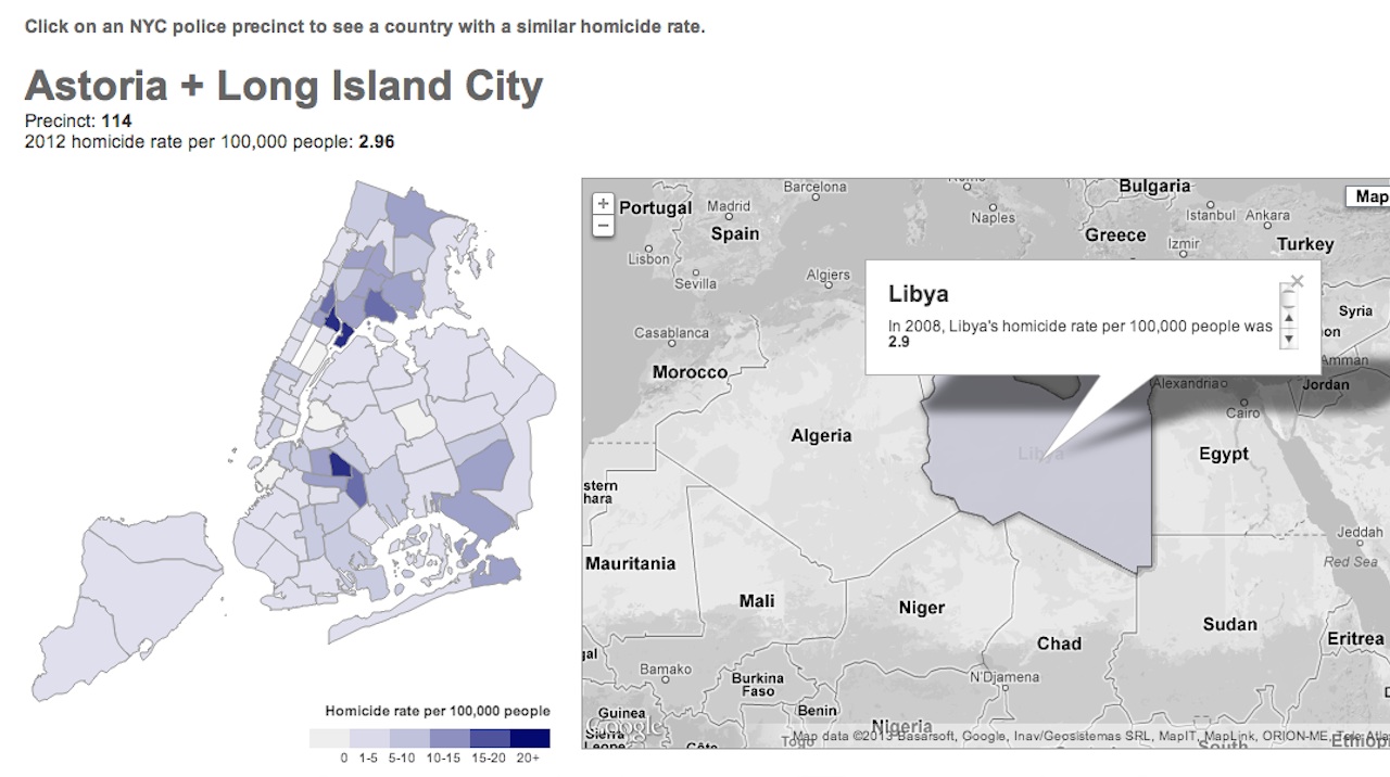
The New York World created this interactive map of New York City, which compares the 2012 homicide rate of each police precinct to that of a similar international country. Astoria/Long Island City, with its 2.96 homicides per 100,000 people, is like Libya; East Harlem, with its 25 homicides per 100,000 people, is like Brazil. My neighborhood is like New Zealand, with its 1.5 homicides per 100,000 people. What’s yours?


