An Interactive Infographic of Every Known US Drone Strike
March 25, 2013 | Andy Cush
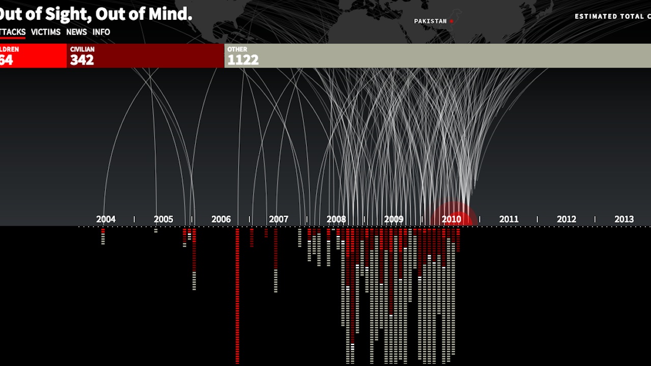
Created by the developers Pitch Interactive, this animated infographic plots every U.S. drone strike and all associated casualties. In just a few seconds, a flurry of strikes and deaths appear, beginning in 2004 and drastically upticking in 2008-2009, when Pervez Musharraf resigned as president of Pakistan and President Obama took office in the states. All told, there have been 3,105 killed by American drones, 175 of whom were children. Watch the infographic here.
Wondering what exactly the metadata Google hands over to the NSA every day is comprised of? Here you go. Created by the MIT Media Lab, Immersion collects all data from your account regarding to and from whom emails were sent, then creates an interactive infographic mapping out all of your…
There have been 116 State of the Union addresses since the 1900s. The Washington Post has a nifty interactive infographic illustrating word usage frequency, in neat little circles. See how the 20 presidents used words. See "communism" get replaced by "terrorism" (108 times in 2001 from Bush Jr) and the…
How much did it snow across the five boroughs last night and this morning? ANIMAL created this infographic, which shows the average and maximum recorded snowfall in each. The Bronx tops the list with 11.6 inches of average snowfall and a 9.4-inch average, and Manhattan comes in last, with a…