Tag: Infographics
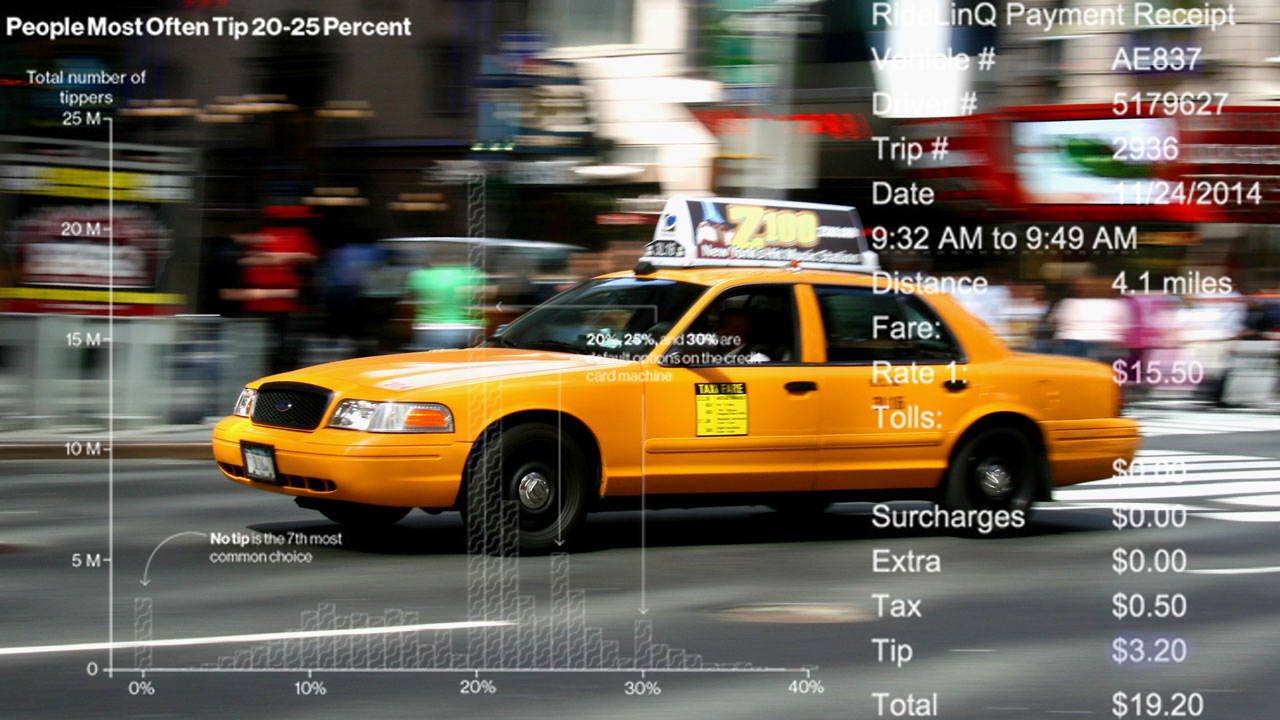
After reading a recent Businessweek article about how much New Yorkers tip cabbies, Ben Wellington at I Quant NY (IQNY) noticed something weird about the numbers. With some research and analysis, he discovered that half of New York’s cabs calculate tipping differently. That difference generates an extra $5.3 million a year in tips. Businessweek used publicly […]

The always interesting data-blog I Quant New York (IQNY) has created a great infographic of the oldest liquor licenses in NYC based on the available data. While this doesn’t necessarily mean a list of the oldest bars in the city, it’s actually more enlightening, since it reveals some places that aren’t usually known for being historical […]
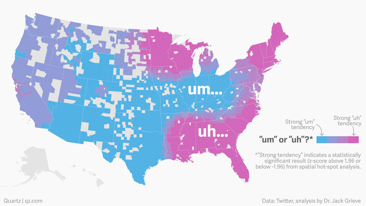
Meaningless words like “uh” and “um” say more about their speakers than you might think, according to forensic linguist Jack Grieve. Grieve used data from Twitter to map the frequency of “uh”s and “um”s throughout the country. The winners are clear in some areas, but muddled in others: Grieve said the use of “um” looks to follow the […]

It’s been a cold, snowy winter, and every time a warm few days threatens to melt the perpetual snow cover, another storm comes and drops more. Based on data from the National Weather Service, the New York Times created this nifty animated infographic that tracks the amount of snow on the ground across the five boroughs and […]
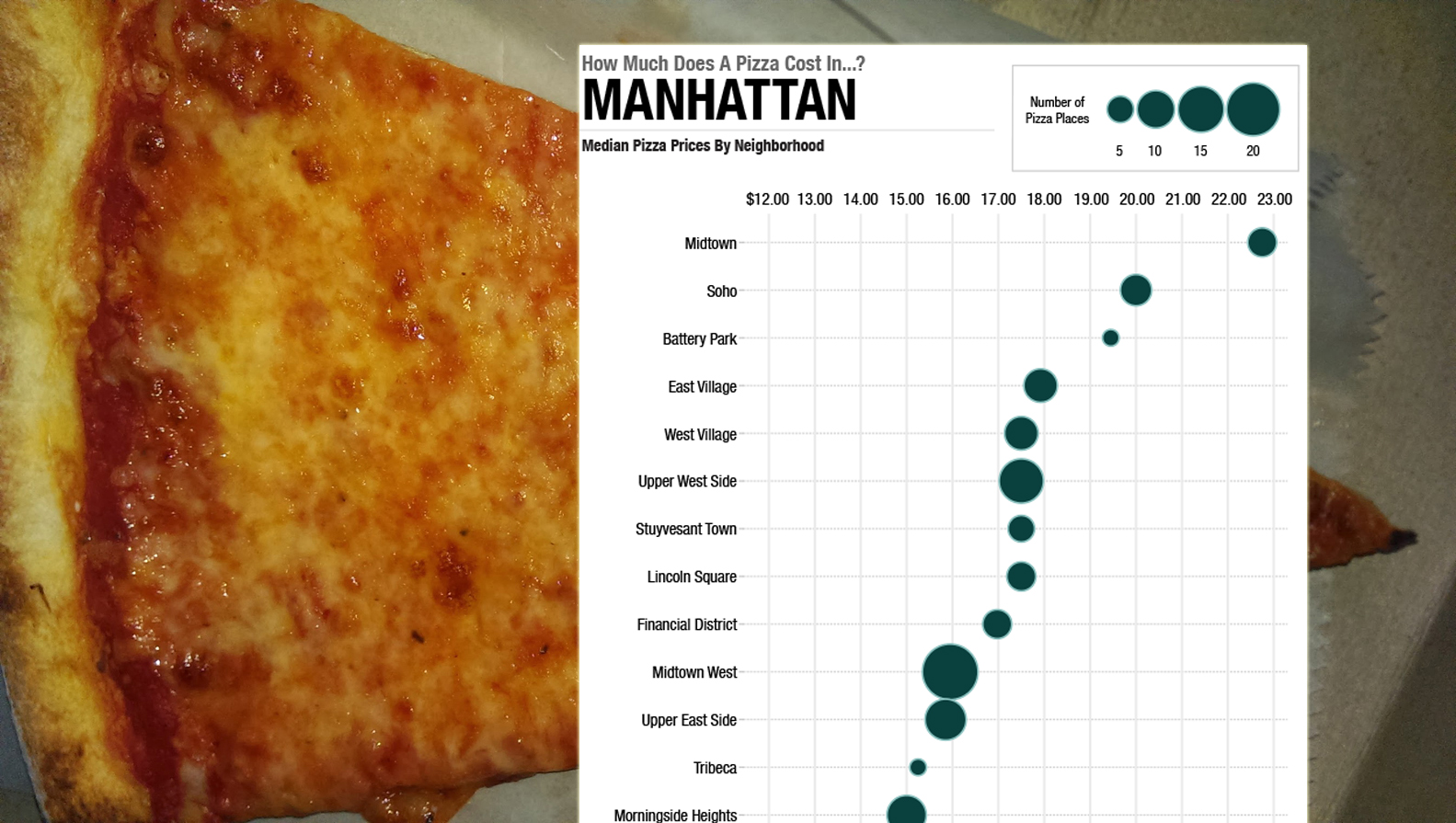
Because pizza is very important, journalists at NPR have crunched the numbers and released this morning’s indispensable infographics averaging the price of a pie across 237 mostly urban U.S. neighborhoods, including NYC. Unsurprisingly, Midtown Manhattan comes in with the highest price at an average of about $23 a pie — meaning you could buy one for less […]
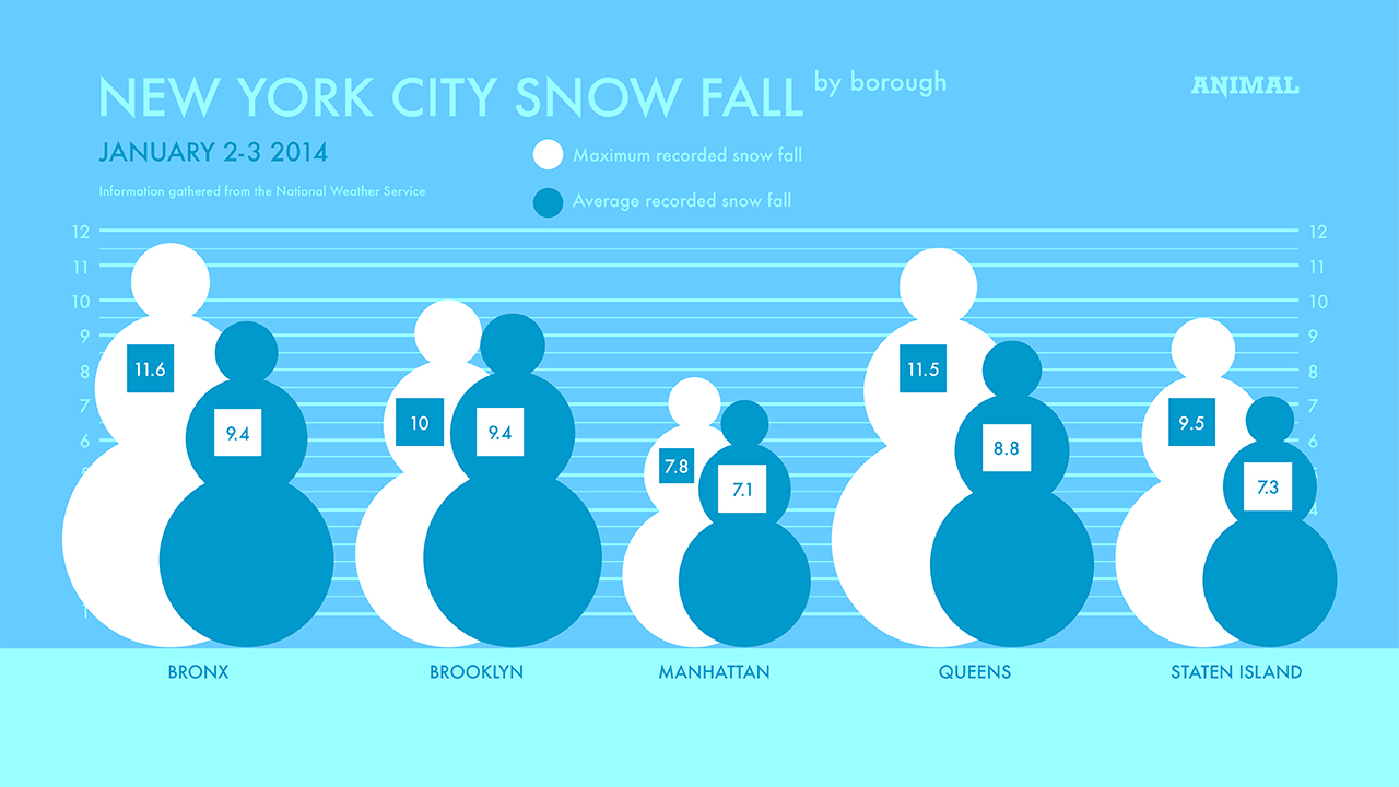
How much did it snow across the five boroughs last night and this morning? ANIMAL created this infographic, which shows the average and maximum recorded snowfall in each. The Bronx tops the list with 11.6 inches of average snowfall and a 9.4-inch average, and Manhattan comes in last, with a 7.8-inch max and 7.1-inch average. […]

We all know the internet hates loves twerking, but just how much does the internet hate love twerking? To find out, we turned to Twitter. How many times has “twerk” been tweeted in the past month? Past week? Day? Hour? We present you with Twerking on Twitter, the infographic: There you go. According to social analytics […]
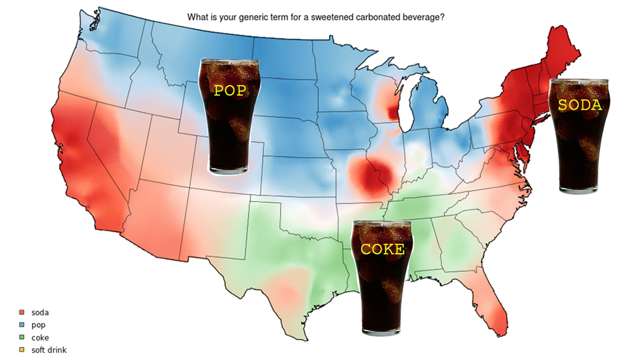
Just in time for Amurrica day, here are some nice little visual odes to our nation’s dialectical disunity. To visualize the vast regional differences in ways we refer to things like carbonated beverages and shoes designed for sports, Joshua Katz from NC State University made this amusing series of colorful infograpic maps. Conclusion: down south, people are […]

Opponents of New York’s bike share are not going to like these stats: Citi Bike is a big hit. Just look at the numbers. A recent poll also indicates support. The NYPD is apparently a huge fan too. […]
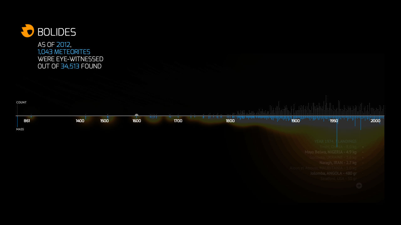
Ever wonder how that Russian meteor from earlier this year stacks up against history’s other giant space rocks? This interactive visualization from designer Carlo Zapponi might help. Dubbed Bolides, it tracks every meteorite that’s touched down on Earth since 86 A.D. with classy 8-bit visuals, placing special emphasis on those that were witnessed by someone firsthand. […]