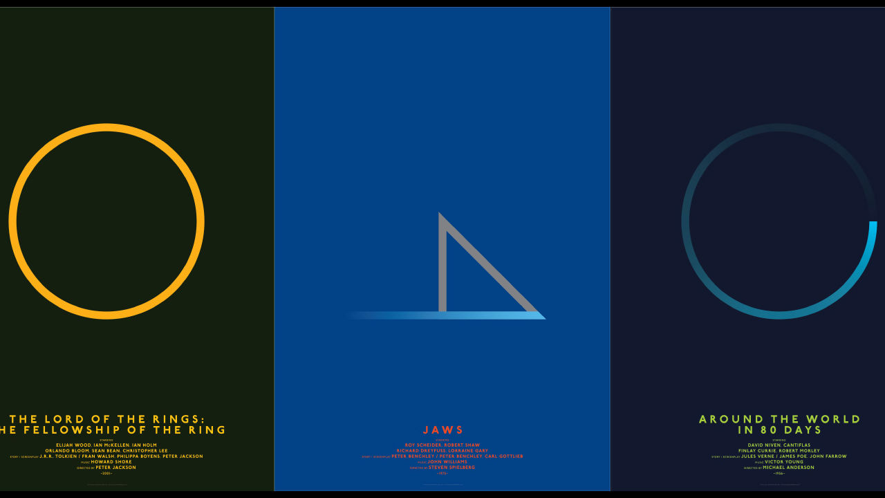
 There’s no surefire way to make your creative work go viral, but for designers, there are a few formulas that see success fairly often. One is make over the aesthetics of an already well-known piece of pop culture–especially a movie, and especially especially if that movie happens to be Star Wars. Another is minimalism.
So in seeing the hook for this work from designer Michal Krasnopolski–posters for classic films, done over in a minimal style–you can be forgiven for rolling your eyes. Get past that jadedness and you’ll be rewarded with some truly outstanding design. Krasnopolski chose a framework–that every element must sit on a simple 2×2 grid (shown here) with a circle and two diagonals laid on top of it–then stuck to that framework with unbelievable rigor. Jaws becomes a single, threatening gray triangle, Superman a single red point soaring into a blue field. A New Hope (of course Star Wars was included) gets a thin, darkened outline of the Death Star. See some more highlights in the gallery.


