Tag: Data

I Quant NY took a closer look at the public data the NYPD released on moving violations issued during the slowdown that took place in December of last year and January of this year. Offenses under the rubric of “moving violations” were one of many that police enforced less during the slowdown, and I Quant […]
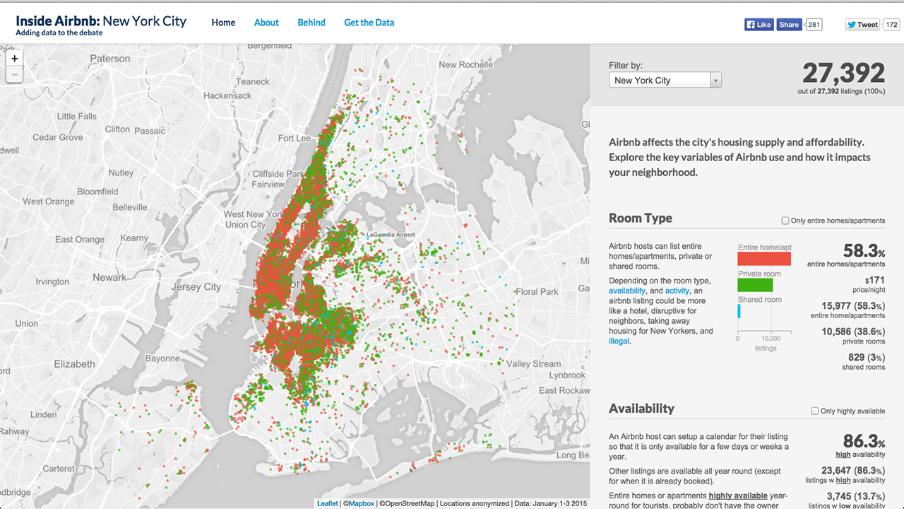
When facing accusations of potentially illegal activity from New York City officials in January, Airbnb defended itself by arguing that a majority of users rent apartments on occasion. The roomsharing service didn’t present any data at the time, but now community activist Murray Cox has scraped data from Airbnb’s site and put together an interactive […]

Navigating the ever-expanding sprawl of New York, a city that’s home to 8.4 million people, can be nightmarish to tourists and natives alike. Ben Wellington, a professor at Pratt, has found a way to make some sense of the chaos that surrounds us by using open data. By mining the city’s data in his blog […]
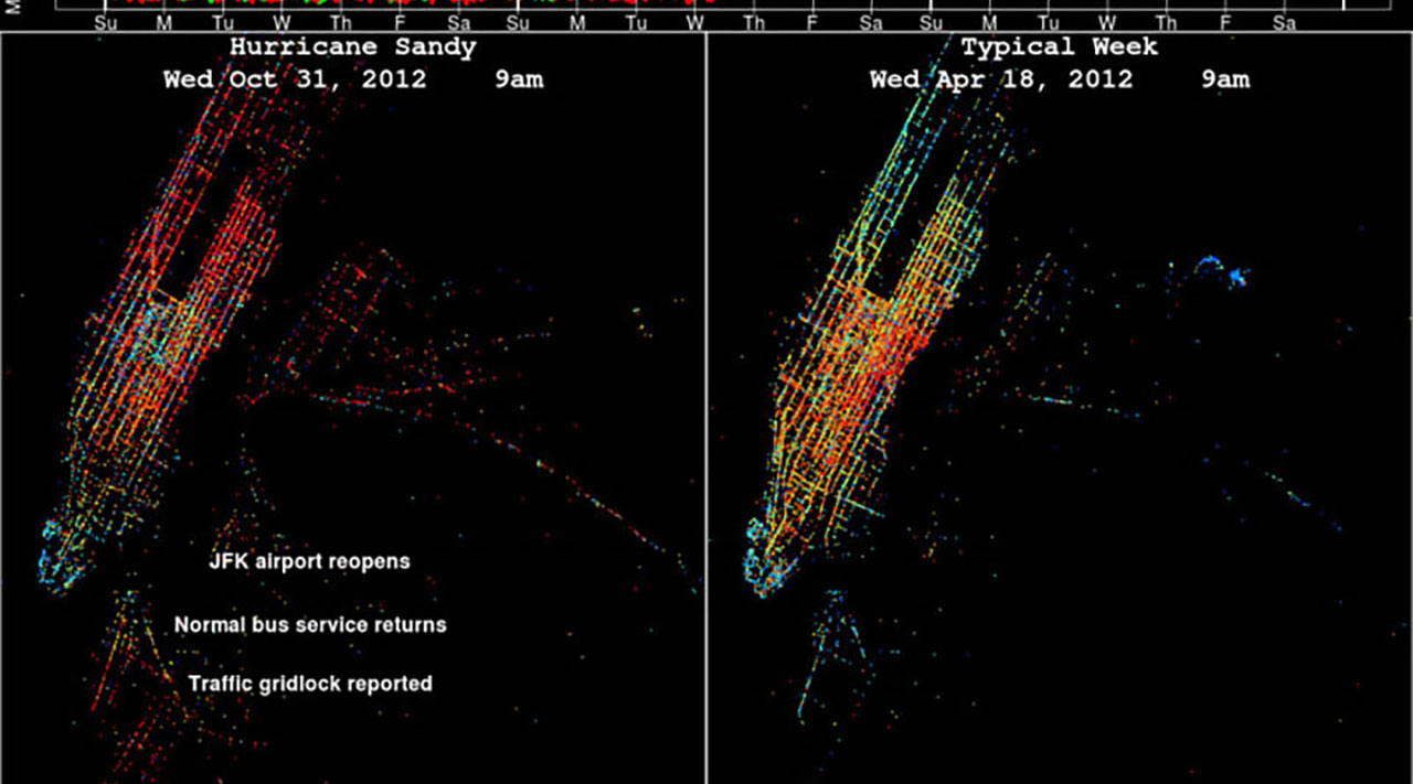
New York City’s resilience during Hurricane Sandy wasn’t just a mood that spread across the city — it was a measurable, chartable phenomenon. Researchers noticed that despite the mass chaos that resulted from Manhattan’s partial several-day blackout, taxi drivers were relatively adept at navigating the city. Charting the paths of New York City’s taxis during […]
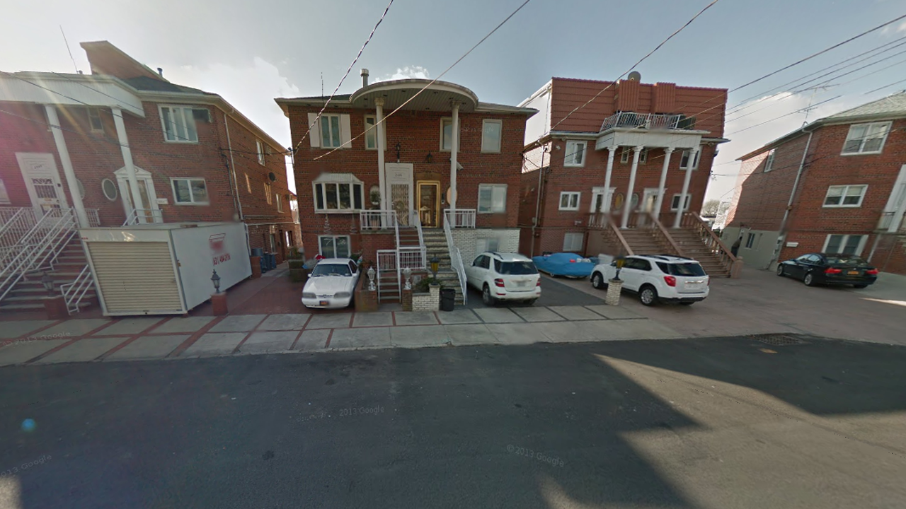
A home at 2336 National Drive in Mill Basin. Number cruncher Ben Wellington of I Qaunt NY, used the same data points he used to determine which apartment in Manhattan is farthest from the subway (0.8 miles), to figure out the same for Brooklyn. According to his math, the property is “about 2.2 miles from the nearest […]
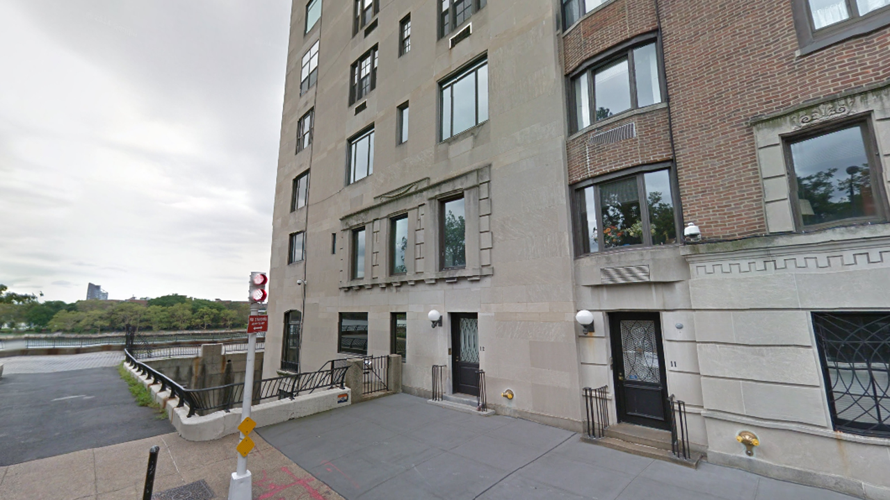
A penthouse at the top of 10 Gracie Square. Ben Wellington, the intrepid data quantifier/visualizer of I Quant NY, has merged publicly accessible information from the MTA Subway Station Entrance data set and city lot directory PLUTO to discover it. The building, located at the end of 84th street at the FDR Drive, is 0.8 miles away along the grid to the nearest […]

Facebook released an “update on changes” they have been working on for the last three months. The internet empire faced a lot of criticism for their “emotional contagion” study when it was revealed that nearly 700,000 Facebook users had their feeds unethically and possibly illegally manipulated to contain more “positive” or “negative” posts without their knowledge. “Were unprepared for the […]

You’re not crazy. Those combination fast food joints — like Taco Bell combination Pizza Hut and Papa John’s combination Subway — are grosser than their individual counterparts, and Ben Wellington of I Quant NY has the data to prove it. Though Wellington previously showed that the Department of Health’s grading system is flawed, here’s a pretty useful chart to help you gauge […]

Two students from the Oslo School of Architecture and Design set out to create a visual representation of social media streams that would change the ephemeral medium into something more solid. Syver Lauritzsen and Eirik Haugen Murvold’s “Monolitt,” is an obelisk that dispenses colored paint in accordance with mood data from social media. The installation relies […]
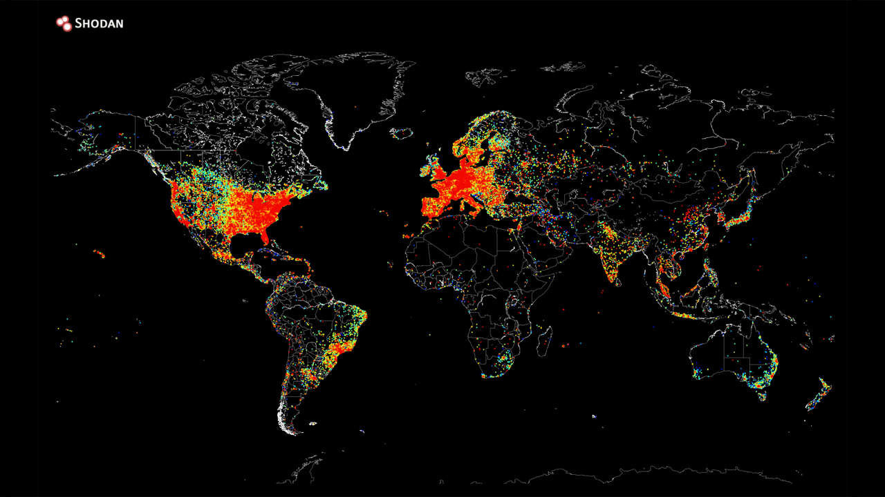
Data-enthusiast John Matherly has created a map of pretty much all of the world’s devices currently connected to the internet by pinging ALL THE IPs with “Are you there?” Quite a few machines disable the reply, but still, that’s pretty amazing. Check out that smattering on the coasts and nothing in the middle. Russia needs to get some […]