
“Responsive Web Design” refers to the idea that a website should look as good on any one platform as it does on any other. See how, when you resize this window, the top image gets a little bigger and smaller with it? That’s responsive web design (RWD). It makes sense–you want your website to make sense on an iPhone, and iPad, and your personal computer–but for web developers and designers, it can be a headache. Clients know that RWD is a buzzed-about, designy term, but don’t understand it on anything more than the most basic level, and demand it anyway.
Borne out of that frustration is “Resize That Shit,” a web game that celebrates and bemoans web design’s trendiest TK. It’s a jigsaw puzzle that can only be solved by–wait for it–resizing your window. The game is face-palmingly difficult at first, but after playing through the first few levels, you’ll be “resizing like a boss,” says Jen Lu, the mastermind behind the game.
“We live in a multi-device/multi-screen world and you need to make sure that you design and code for that world, but how you do that really depends on the site goals,” Resize That Shit lead developer David Justus told ANIMAL. “Sadly I think most people think of responsive as ‘fluid’ layout – and that is what is inspired this game. The goal of a ‘fluid’ design is to create a design the scales to fit the screen – so what if you take that idea and turn it on its head, and create a design that only works at a very specific resolution.”
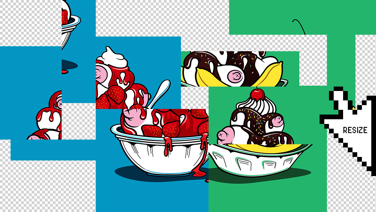
Each level presents a different puzzle to be solved–there’s the deconstructed boob sundaes above, a gang of cartoony monsters, and a slew of others.
A game that parodies web design’s current obsession with cross-platform fluidity–this thing should be even more fun to play on a touchscreen device like an iPad, right? Not so fast. “The ultimate irony,” Justus says, “is the game doesn’t even work on mobile devices.”
