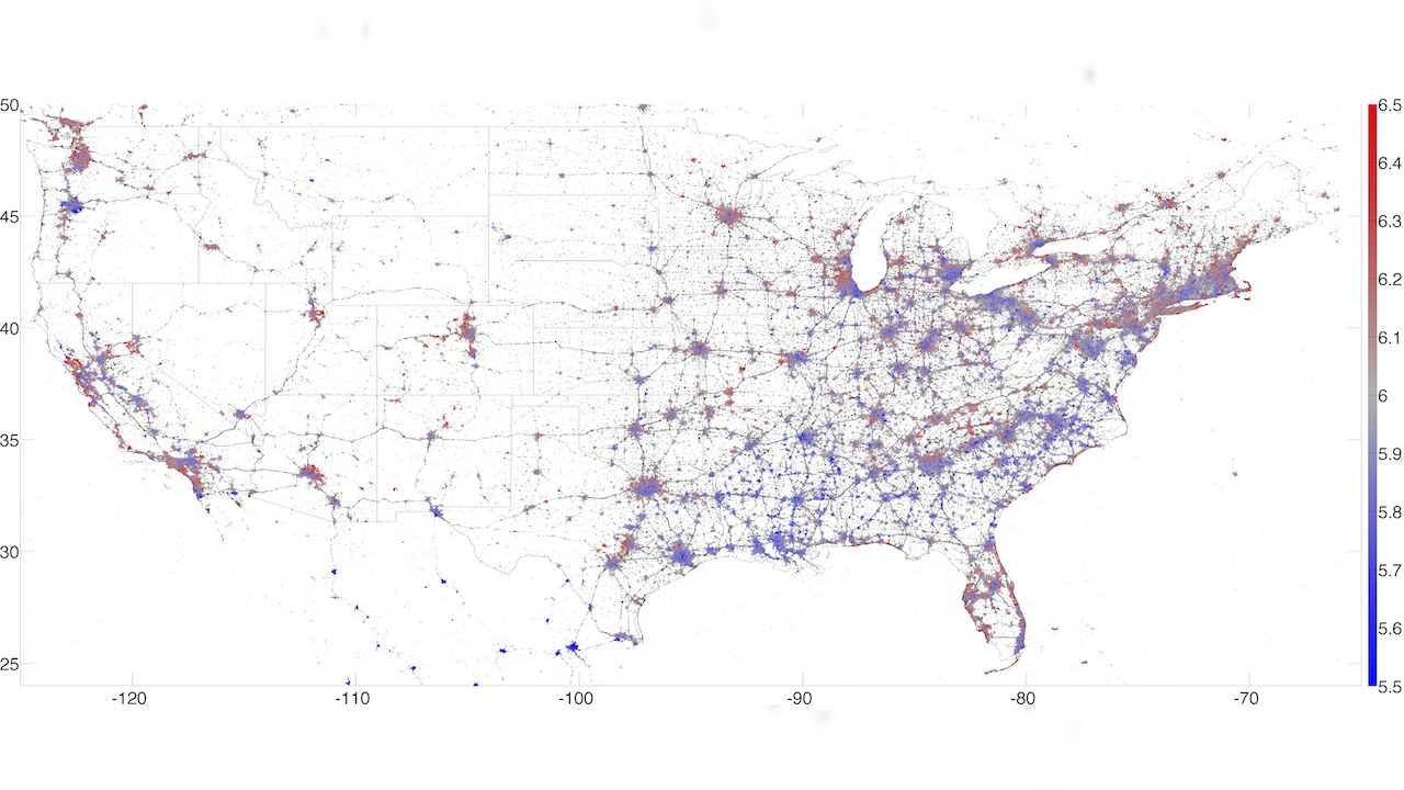
Having already pinpointed the happiest intersection in Manhattan at 7th and 77th (near Hayden Planetarium), the applied mathematicians at Computational Story Lab are expanding their scope in an effort to map out the existential condition of the entire country. Unlike art cartographer Eric Fischer who used geotag data of tweets to map density of twitter users on the streets, CSL used the content of ten million geotagged tweets from 2011 onward to map out happiness on a nationwide scale based on the frequency of certain words.
Here’s the key: red means 🙂 blue means 🙁
Southern states tend to produce sadder words than those in northern New England or out west. Hawaii emerges as the happiest state and Louisiana as the saddest, due to relative differences in the frequencies of happy and sad words used in each state… Zooming in further to the level of cities, we produced a similar list for 373 cities in the lower 48 states… With a score of 6.25, we found the happiest city to be Napa, CA, due to a relative abundance of such happy words as “restaurant”, “wine”, and even “cheers”, along with a lack of profanity.
So, Disneyland is neither the happiest place on Earth, nor the happiest in California. New York is a lot like Seattle (happy) and nothing like Texas (sad). The north side of Chicago (happy) is nothing like the south side (sad). Results are not all that surprising and generally reflect socioeconomic make-up. Should the experiment seem a little reductive or absurd, or a little like those meaningless perennial listicles in Forbes, feel free to read over their disertation-length explanation of their methodology and word analysis at PLoS ONE.


