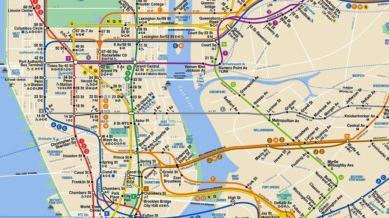
This ingenious infographic, created for the New Yorker by designer Larry Buchanan, illustrates New York City’s wealth disparities by plotting median household income against every subway stop in the city. Each train line is displayed individually, making it very easy to see the close relationship between geography and money. Witness the immense dropoff between Grand Street and Montrose Avenue on the L, for example, which jumps right back up at Morgan Avenue, or the income spike in Manhattan on every single line. See how your stop stacks up here. Via Co.Create.
New Yorkers finally get a say in which voice will alert them when their train is approaching. The much-anticipated Second Avenue Subway won't be up and running for a few more years, but the ever-democratic MTA is now inviting commuters to vote for the new voice of the T line.…
Good news for watchers of the Second Avenue Subway: progress! The 80-year-old project received its first-ever shipment of rails today, a cargo that will be stored in a "cavern" at 96th Street until further notice, according to the New York Times. Okay, it isn't much, but it does look like the MTA…
The biggest badass of the month is a 54 year-old-man who was mugged in the West Village, then chased his attacker through a subway tunnel. DNAinfo explains what went down. Jeff Hamm, 54, snatched $94 in cash and a $2 lighter from a 54-year-old man at Sixth Avenue and West Fourth Street about 7:30…