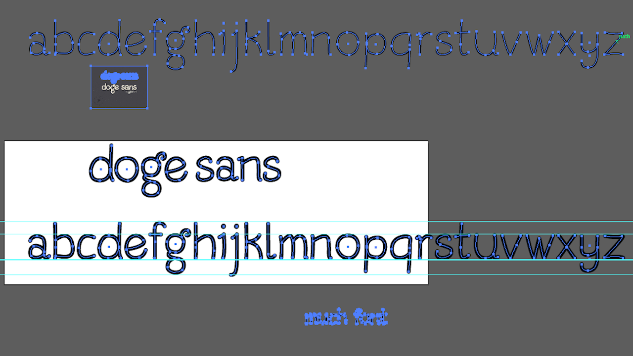
In an effort to give the fledgling cryptocurrency Dogecoin a more “unique identity,” Redditor and Dogecoin-er Grazsebastian proposed something radical: do away with Comic Sans, the infamous typeface that’s provided Doge’s John Hancock from the start, and replace it with Doge Sans, a custom-built font, based on Comic Sans, that’s just for Doge. Here’s what he wrote, via The Daily Dot:
I think if we are to grow as a currency we need to have a unique identity – and a custom tailored typeface is a first step towards that! Doge sans is inspired by Comic Sans but has it’s own style and dogeness about it – keep in mind that we can design this typeface together so that everyone shibe is satisfied since I’m much open for critisism [sic].
That’s the alphabet for Grazsebatian’s prototype Doge Sans — all lower case, natch — above. Nice, I guess, but what was wrong with Comic Sans? It’s beautiful in its unpretentious ugliness, while Doge Sans feels like it’s trying too hard to be gaudy. It’s like a typographical version of The House That Drips Blood on Alex.
Some type nerds on the Reddit thread agreed. “Other than simply being an alternative, why is Doge Sans better than Comic Sans? There seem to be a lot of comments here that praise this typeface only because Comic Sans is so reviled,” wrote one. “If we’re going to make a new font in the name of Comic Sans being horrible, let’s at least make one that’s more legible,” agreed another.
Of course, doge is as good as dead anyway, so it doesn’t matter much. Still: Comic Sans to the moon!


