
ANIMAL’s feature Artist’s Notebook asks artists to show us their original “idea sketch” next to a finished artwork or project. This week, Chicago-based artist Sam Rolfes talks about his typeface/word world building series, which recalls monolithic islands, bathroom lighter tags and 3D scans of his childhood home.

Rather than manipulating the kind of polychrome, malformed figure I normally obsess over, this time I collabed with Chicago’s Avondale Type Co to reinterpret one of their typefaces, Essay, for a print series. My initials, S and R, a symbol (I chose ≠ because I thought it’d be a little dickish and funny), and ATC’s logo. They had laid the foundation, and it was up to me to elaborate on it in a way that functioned more meaningfully than just an overblown Photoshop filter. It was hard.
It was also pretty clear from the get-go that since I was unable to really alter the silhouette of the typeface, I’d be building on top and inside of those boundaries, like planting foliage within the rails of a garden. This project was word world building. I did a few initial sketches on how they might flow–which ended up resembling some dope Bic lighter-tags in the bathroom of an Austin coffeeshop I used to frequent:

Each project I’ve committed myself to for the last year has been by and large a continuation of the project that preceded it–I rarely start with a new project file, rather choosing to reinvent and remix previously sculpted elements when possible. In the process of stretching, extruding, and painting the digital clay that makes up the majority of my work lately, new branches of imagery spontaneously hop out and begin their own investigations.
Keeping this in mind, I started out with the skin of a previous project, figuring maybe I could build a fleshy exterior and nestle the letter within it (in this case, an “A”).

Naaah…. It’s a husk, a pretty husk, but not what I need and a bit too Jack Skellington for this project..
I’ve been actively trying to take myself less seriously lately; less esoteric pseudo-futurism and a de facto ban on the copious notes that gummed up the creative process during my undergrad. More jarring patterns and stupid lines is what I want.

What I needed to do next was just let my tablet pen flow across the screen and crack the surface of the sculptures, keeping at it until they coalesced into something interesting. I began carving out landscapes, pulling out figures, and clumping together odd polygons from previous projects until I landed on a hilly landscape protruding from a horizontal “S”. I decided that’s the way to go with at least one of ’em.


Shredding the 3D mesh, I replaced every polygon comprising its virtual atomic structure with a squadron of greyish heads, laying a foundation of decapitated victims under the soil of the slowly forming platform (maybe in effigy to the countless brain cells that have perished during the course of this project).

Once again I try to call back to the original sketches and snake a fat black line through the field of heads in an attempt to represent my own loose interpretation. The line mostly just kinda jiggles around self-consciously, and I abandon it once again.


On either the second or third night of toiling away, I erected shoddy buildings with flat, Tupperware roofs and ungraceful facades that intersected each other at rude angles across the typographic landscape in a desperate grasp for some coherent imagery.


Over the course of a few hours, the landscape of heads littering the ≠ plane catch moss, obscuring the grotesqueness of the soil and causing it to resemble a monolithic island.

Good enough for me, I layer in a fishtank-like base and set it against a dying sun to wrap that one up.

Attempting the same process for “R” didn’t fare as well.

Seeking some realism to unsettle the compositions, I messaged my brother and requested some 3D scans of our childhood home.

At this point, morale is high, but hygiene is running on fumes and I fear leaving the conference room of the coworking space I’ve ensconced myself in for over 8 hours, lest I be mistaken for a lecherous ghoul by the locals and pelted to death with rocks…

Nevertheless, “R” must be vanquished and I’ve set my sights on it in an appropriately militaristic manner.

I fold in several of the elongated 3D scans and begin to swing it around and reorient the assemblage over an abrasive background…

…violently scrawling out the outline of an uppercase “R” with a series of smaller “R”s.


As the collision of “R”’s and 3D scans finally congeal into a form I can work with; another thread of an idea escapes this project’s orbit while I experiment with reducing the colors to red and blue.


This might work as a background for a cartoon pitch I’m working with a fellow Join The Studio member on, but it’s nevertheless unfit for duty as a final piece in this project. It also kinda looks like Optimus Prime holding a hand-rolled cigarette by moonlight, which I now cannot unsee and will have to deal with later, dammit. The finished “R” was cleaned and elaborated in Photoshop, and set against the same dying sun that doomed the ≠.
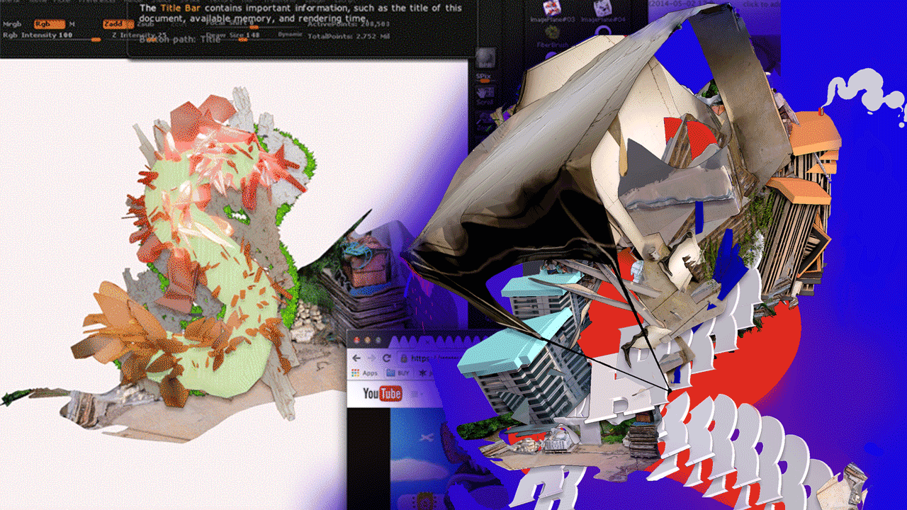
Next is the “S”. My head hurts. I’ve grown sick of building cities and shredding letters, and in exasperation I decide to build an isometric Sim-City-type environment for all my misfit ideas to live in, and then crash a fucking worm through it.

The worm is made of clusters of stacked R’s and led by an enormous head mounted to the front, extruding out from a billboard in a morbid procession to punish my stupid boxy buildings for their insubordination.

It’s satisfying, and another potential path to follow for another project, but it’s not what I need. Finally returning back to the idea of embedding an organic play off of the original letter within a frame of the silhouette…

…the “S” takes shape and I plop it down within the arms of a 3D scanned corner from my past home.

Set leaning against a 3D scan of the last remaining corner of a rapidly drowning childhood landscape, this one too is wrapped up. And the ATC logo was honestly me just having fun screwing around with the letterforms into an angrylooking flag.

SAM ROLFES X ATC ARTIST SERIES (2014)


Previous Artist’s Notebook selects:
Artist’s Notebook: Rebecca Patek
Artist’s Notebook: Sean Joseph Patrick Carney
Artist’s Notebook: Lincoln Correctional Facility Prisoners, Kate Levitt, Miles Pflanz
Artist’s Notebook: Leah Schrager
Artist’s Notebook: Ramsey Nasser
Artist’s Notebook: Eva Papamargariti
Artist’s Notebook: Brenna Murphy
