Artist’s Notebook asks artists to show us their original “idea sketch” next to a finished artwork or project. For this edition, Lawrence Mesich explains his video sculpture “Distributed Risk,” a commentary on the financial crisis.
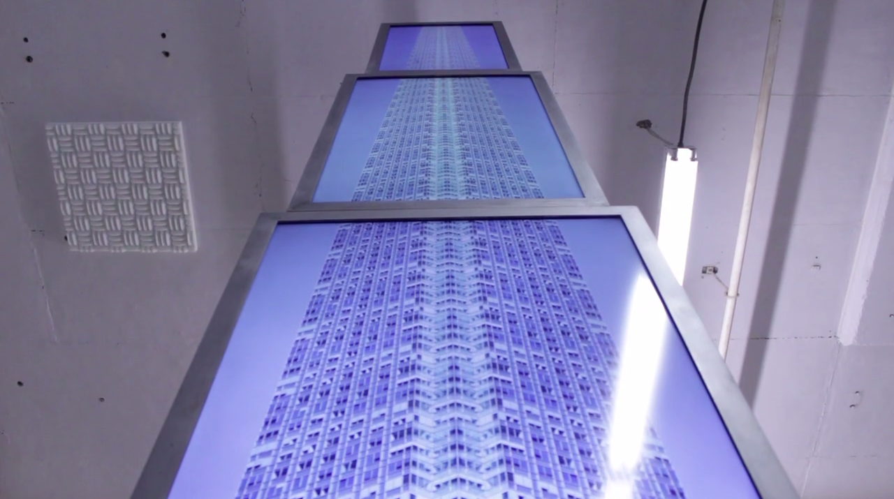
The image in my head for Distributed Risk was the facade of One Court Square stretched across four successively smaller video monitors that attached to a free standing sculpture made of steel beams, with the building moving upwards at a slow, constant crawl. I wanted this piece to address the financial crisis, and an infinitely tall building seemed to embody the persistent fantasy of perpetual growth that grips the financial industry whenever a market bubble is about to burst. The video is like a perverse data visualization, with the building as bar graph.

I made a 2D vector drawing of the structure using Illustrator and used that to work out an initial design, then used that drawing to make a 3D mock up. I spec’d out materials – a set of monitors, media players, and steel for the structure – to figure out the scale and what it what it would cost. The answers were ‘big’ and ‘expensive’. So I applied for a grant through Queens Council on the Arts. I wanted a compelling image for the application. The 3D mock up felt flat, and I thought building a model and photographing it would make a better image.

It turned out to be much more useful. It helped me work out the scale of the materials (2” angle and flat bar) and the position of the monitors, which I decided to cantilever out from the structure. It also helped me work out how to make it modular (mending plates and bolts). I made it at 1:6 the scale of the drawing, or 23” high. I set it up in a diorama and photographed it. I waited about 10 weeks for a response and took a break from the piece. It took me about a month to find a fabricator to work with, and I shopped for monitors and made new diagrams while I asked around. A friend referred me to sculptor Cody Hughes, who agreed to help me make the structure. The monitors got delivered around the same time. It took another month or so to refine the diagram and work out design problems. The most difficult issue was figuring out how to attach the monitors to the structure and keep them aligned. I also wanted to make frames for the monitors but hadn’t worked out how. It took us another month of prototyping different designs before we had a solution. Once that was done, Cody started cutting and welding and I started working on the videos. Practicing on the model turned out to be important. We worked from a 1:1 scale vector drawing that we used as a reference for all of the measurements and assumed an ⅛” tolerance. I worked out the exterior angle of the building image by laying out and measuring the monitors in my studio. I took new photos of One Court Square and made a composite section that I could use to make it [look like] a continuous, creeping surface. I made another scale diagram to line up the video to each other, and the tests worked perfectly.
Cody and I kept making, trading and adjusting diagrams while he cut and welded and I finished the videos. I planned to show the piece during Bushwick Open Studios and we were uncomfortably close to the deadline. We assembled it in my studio over two days and finished it with about fourteen hours to spare.

Once I had a chance to look at it, and stand under it, it felt lot like the material that got me started. It was absurd, and a bit frightening.
It packs up pretty nicely, too.

(Images: Lawrence Mesich)


