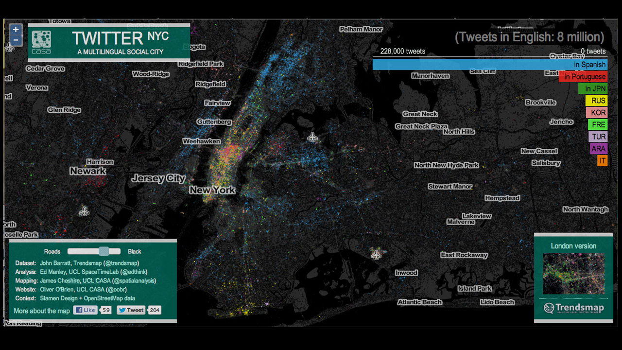
Aren’t you loving Twitter’s ability to turn your life into a statistic? Yes? So, here’s an interactive map that the Gothamist found, depicting a vast diversity of languages tweeted throughout New York City, as detected by Google Translate. See the density of each language is visualized by neighborhood: English (grey), Spanish (second-most-tweeted language: blue), Portuguese (red), etc.
The resulting infographic map looks like ethereal globular cluster of diversity. The Gothamist points out that the data doesn’t quite match up with the city’s own statistics on language distribution. For example, while Chinese people form the second largest immigrant group in NYC, their presence on Twitter is apparently much less prominent, bringing to light certain cultural tendencies regarding social media use.
More specific maps depicting single languages, and other relevant stuff from creators James Chesire and Ed Manley, are available here and here.


