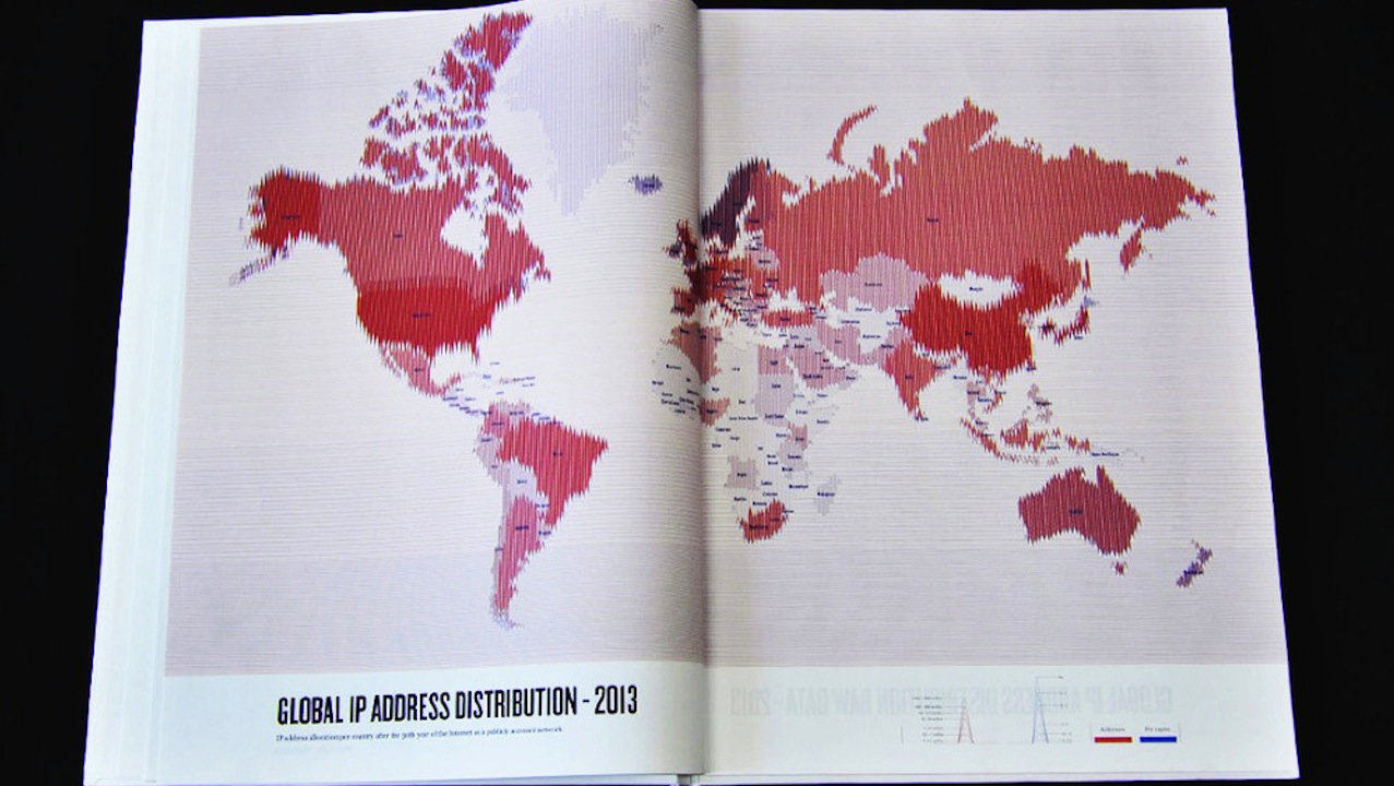
In an effort to map the world in a way that reflects the way we experience it in 2013, Israeli designer Dafna Aizenberg created the Atlas of the World Wide Web, a series of charts exploring things like IP address distribution, speed of internet connections, and popular search terms across the globe. Each beautiful design is meant to aesthetically reflect the data it represents, with cybercrime stats appearing in sinister dark colors, spam email in a series of tangled lines, and the growth of the world’s most popular social network appearing in Facebook blue.
“he challenge was to create a generative system without any computer-generated graphics, as I wanted to have full control over each map,” she told Wired. “Although the entire Atlas needed to keep the same general aesthetics, it was clear that each chapter has to adapt itself to the subject at hand and be unique.”
See some images from the Atlas (which is currently seeking a publisher!) above.


