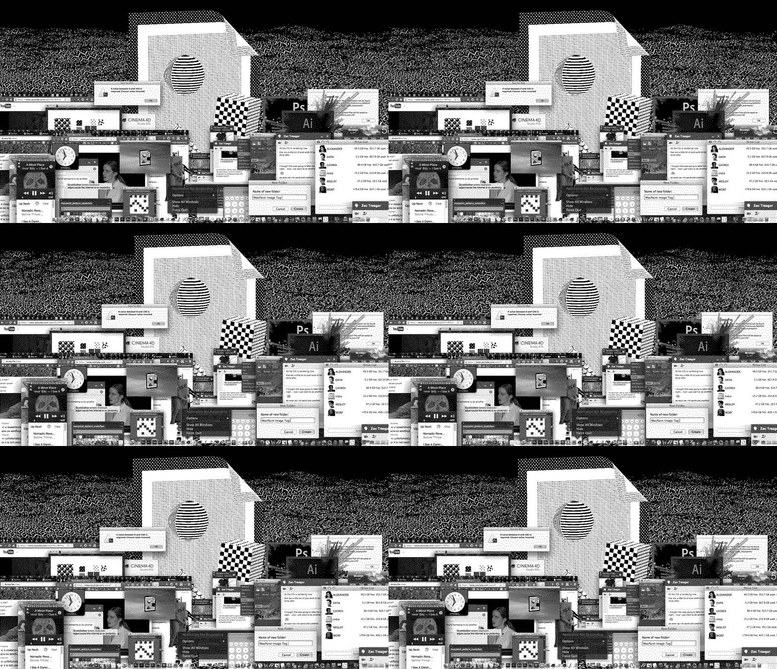
ANIMAL’s feature Artist’s Notebook asks artists to show us their original “idea sketch” next to a finished artwork or project. This week, newly Brooklyn-based artist Scott Gelber talks about his videos “Image 02” 003 and “Image 03” 004 inspired by skeuomorphism and the original “broken image icon.” The videos feature music by Zac Traeger and Arjun Ram Srivatsa.
Lately, I’ve been thinking a lot about skeuomorphism in design/art–it’s purpose, and what might come from growing out of it.

These thoughts were precipitated by, but not limited to, the design transition from iOS6 to iOS7. Initially, Apple designed the iOS interface to emulate the appearance of physical buttons. They appeared raised, with little specular highlights. Six versions later their designers finally felt like they could take the training wheels off, the interface became it’s own digital environment with few cues from the physical world. “We trust you to know this square is a button now.” Hate the design or love it: This is win for visual literacy.


This project is a continuation of a series called “Image.” Every iteration of the project uses the same 3D geometry and camera movements. An assemblage of 3D primitives to create a 3D version of the iconic “Image Icon” and “Broken Image Icon.”


When creating work, I’m always trying to find the “eye-level” with myself and a potential audience. I make a lot of cultural reference in my work. Below eye-level might be Mortal Kombat, maybe looking to a possible trigger for nostalgia, common ground. (See also: Cheating. Guilty.) Above eye-level is me including a Peter Paul Reubens painting in my work, one of his myth paintings; a reference that requires a rich Western education (or in my case; a chance encounter on the internet.) Both of these things can work at eye-level if the work doesn’t depend on knowing the reference, but in this case they are reduced to decoration: to [ugh] aesthetic.
Abstraction defies this eye-level approach. Anybody can look at one of Vince Mckelvie’s abstract GIFs and say “woah psychedelic! [★Like] Awesome.” At the other end, someone with a trained eye might see elegant hypnotic forms and movement, math dancing.

Mac Paint is a beloved Mac app that predates the image icon by 10 years. I am sampling its iconic patterns and experimenting with them as textures in my 3D software. (There is a browser-based emulator of Mac Paint.)
I experiment with how to project these textures onto my 3D geometry. After failing with “flat projection,” I use a combination of other methods, none of which are terribly interesting.

I have a fun collaborative relationship with the site dump.fm, I often post unfinished versions & drafts and ask for feedback. There is a 50/50 chance I’ll get any usable feedback. Joel (@pretzel) was very helpful. Without consulting the internet, this… might have been this…


A rule of this series is that I collaborate with a different musician or sound designer for each video. Zac Traeger was a natural choice as we have collaborated many many times in the past. I have spent more than two months touring with his band Zorch doing their live visuals.

Zac designed 6 pieces of sound for my 3-channel video and virtual reality game installation ∆DELTA. He also created scores for my video DOOMII and two station IDs for Adult Swim. Zac is an enthusiastic collaborator, the only kind I’d care to deal with.
After he accepted the project I sent him Mac startup sounds in hope he’d sample them. We used GChat & Google Hangouts to communicate, he lives in Austin, Texas. I recently relocated from there to Brooklyn. I was extremely happy with his work, it merits many listenings.

After rendering the Image Sequence, and a shadow map from Cinema 4D, I open the files in After Effects. The Shadow map is used as an alpha matte for an Adjustment Layer set to Invert the colors. The shadow inverts the blacks and whites. The “Invert” function was the only effect found in MacPaint.
Finishing short of the deadline, I decided to seek out another collaborator for a 4th video. While checking Facebook, my friend Arjun posted a link to an archaic chatroom called giffer.com. Arjun is a musician and it made perfect sense to ask him to collaborate. After sending him a single image…

…and giving him a time constraint, about an hour later he sent me “gelber.mp3.” The music is beautiful.
I think the final render of the MacPaint version (“Image 02” 003) is successful, until it’s torn apart by Vimeo’s re-compression. I waste hours trying different settings and codecs and seeking help but the sharp edges and fine details are lost into noise. It looks like datamosh or glitch art, I’m annoyed.
The “Image 03” 004 video came out as planned. Mission accomplished.
SCOTT GELBER, “IMAGE 02″ 003 AND “IMAGE 03″ 004 (2014)


Previous Artist’s Notebook selects:
Artist’s Notebook: Sam Rolfes
Artist’s Notebook: Rebecca Patek
Artist’s Notebook: Sean Joseph Patrick Carney
Artist’s Notebook: Lincoln Correctional Facility Prisoners, Kate Levitt, Miles Pflanz
Artist’s Notebook: Clement Valla
Artist’s Notebook: Eva Papamargariti
Artist’s Notebook: Brenna Murphy
Artist’s Notebook: Andrea Crespo
Artist’s Notebook: Yoshi Sodeoka
Artist’s Notebook: Rollin Leonard


