Tag: Design
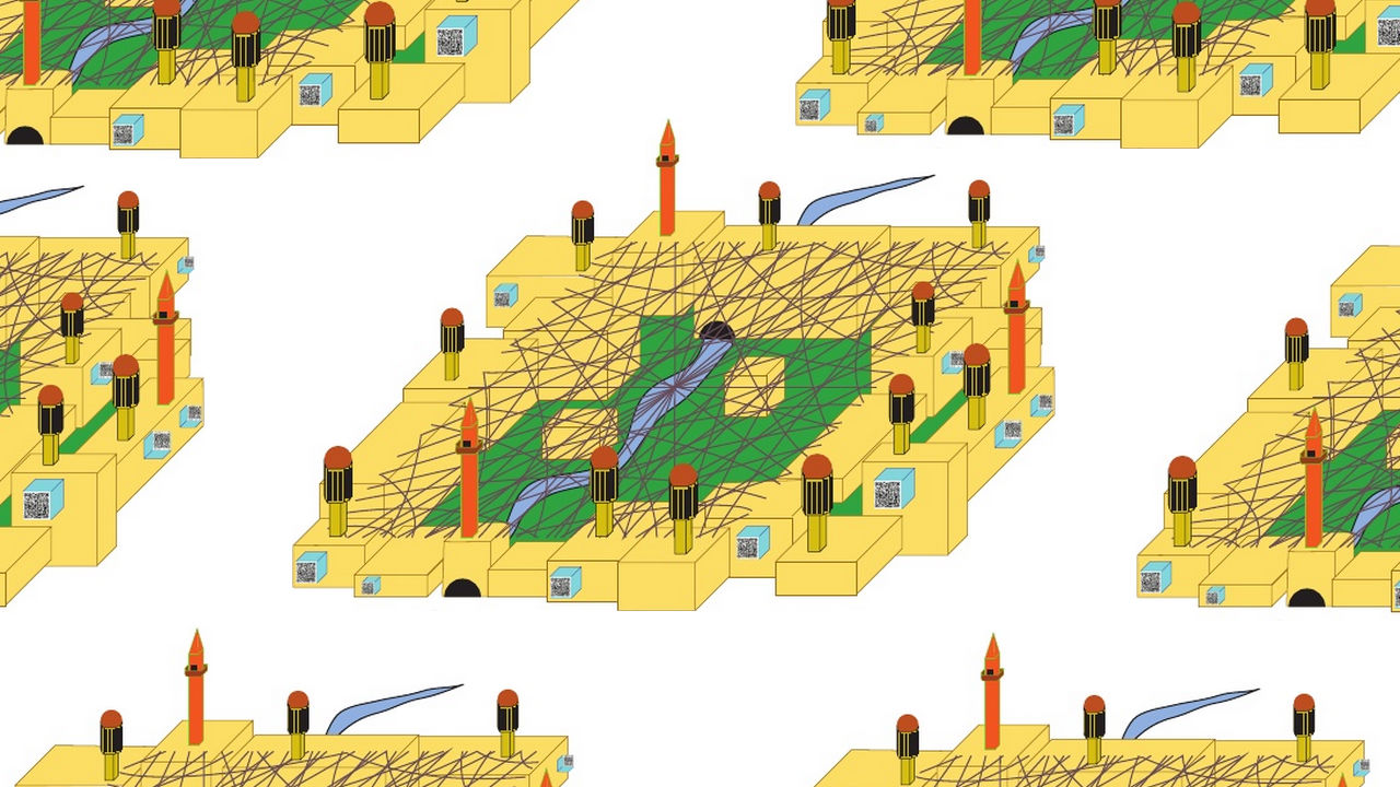
That illustration above is law student Asher J. Kohn’s concept of what a fully operational drone-proof city might look like. Rather than building barriers to keep people out and deter weapon strikes like traditional defenses, Kohn’s concept–called Shura City–includes several technologies that obscure people and their movements in order to make them untraceable by UAVs. […]

“It turns out that, while a folding wheel is useful for cyclists, it can actually be life changing for wheelchair users,” says Vitamins Design’s Adam Westaway of his company’s brand new fold-up wheel. “There are so many problems associated with storing and transporting wheelchairs, and the biggest problem is the wheel size.” Westaway and the […]
Here’s one of the more awesomely infuriating apps you’ll ever see advertised: Moritz Greiner-Petter’s Tick, which commands your computer’s pointer to do loop-de-loops even when you’re moving your mouse in a straight line. According to Grenier-Petter, the idea is to get people taking stock of the programming that defines much of the ways we live […]
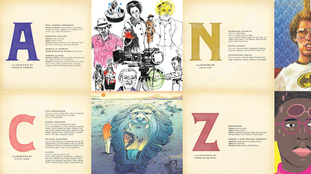
To commemorate Sundance 2013, the film festival’s organizers commissioned designer Todd Oldham to create an illustrated book that gives an A to Z history of the storied institution: A is for auteurs Paul Thomas Anderson and Robert Altman, F is for Flirting with Disaster, the breakout film from Silver Linings Playbook director David O. Russell, and […]
HTML5, the language that’s helped usher in the web’s current incarnation–with its infinite scrolling, emphasis on interactivity, and beautiful custom page layouts–is still a relatively new technology. It’s already spawned some classics (and might I humbly submit this for consideration?), but by and large, its full potential has yet to be seen. Designer and developer Jongmin […]
The Brooklyn Public Library appears to have taken some design inspiration from TRNDY BNDS and FSHN LBLS for its vowel-eschewing new logo. Not to be Mr. Conservative Spelling-Police, but shouldn’t an institution that promotes literacy at least get the spelling of its own name right in its logo? Plus, anyone who’s anyone knows that if you’re […]
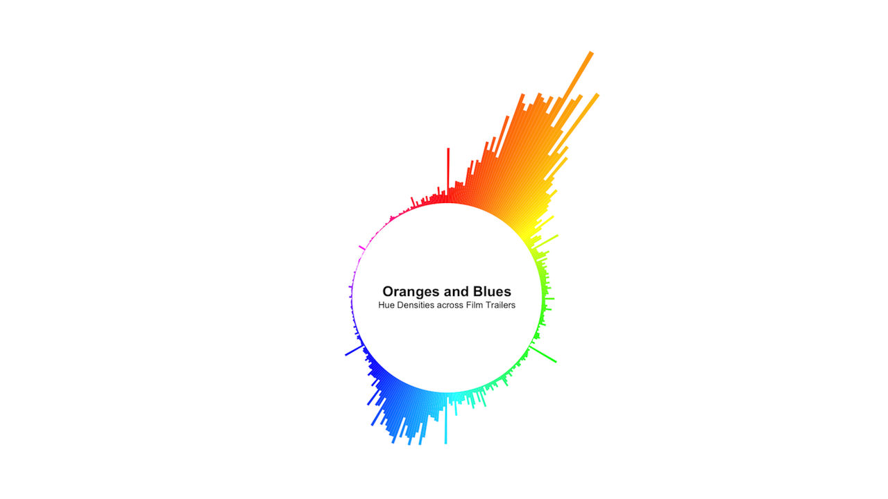
Edmund Helmert, the creative mind behind BoxOfficeQuant, can be thought of as a kind of Nate Silver for the film industry–researching, plotting, and analyzing data about movies, with hopes to “report on the financial state of the industry and attempt to predict its future.” For his latest project, he used this beautiful circular histogram to […]

Digital artist Andy Willis creates the above beautiful collages by analyzing each second of a film for its most prominent hue, then displaying those colors on a 60-wide grid–turning iconic movies into abstract streams of color. His works, called “Spotmaps” are as functional as they are aesthetic: scanning the maps of the first three Die Hard films, […]
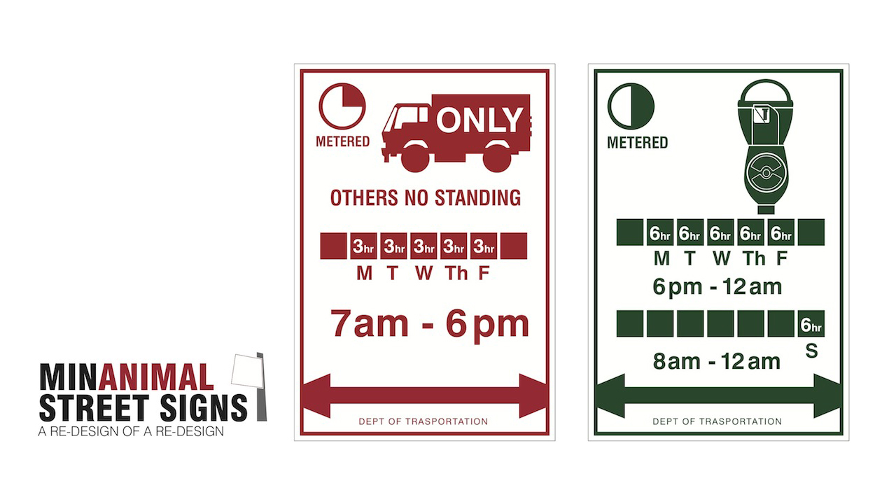
Last week, the City of New York announced that it would be rolling out newly designed parking signs to replace older, more confusing ones. A major part of that overhaul, which was done by a design firm with one of the coolest names ever, consisted of a “simplified layout that cuts back on the number […]
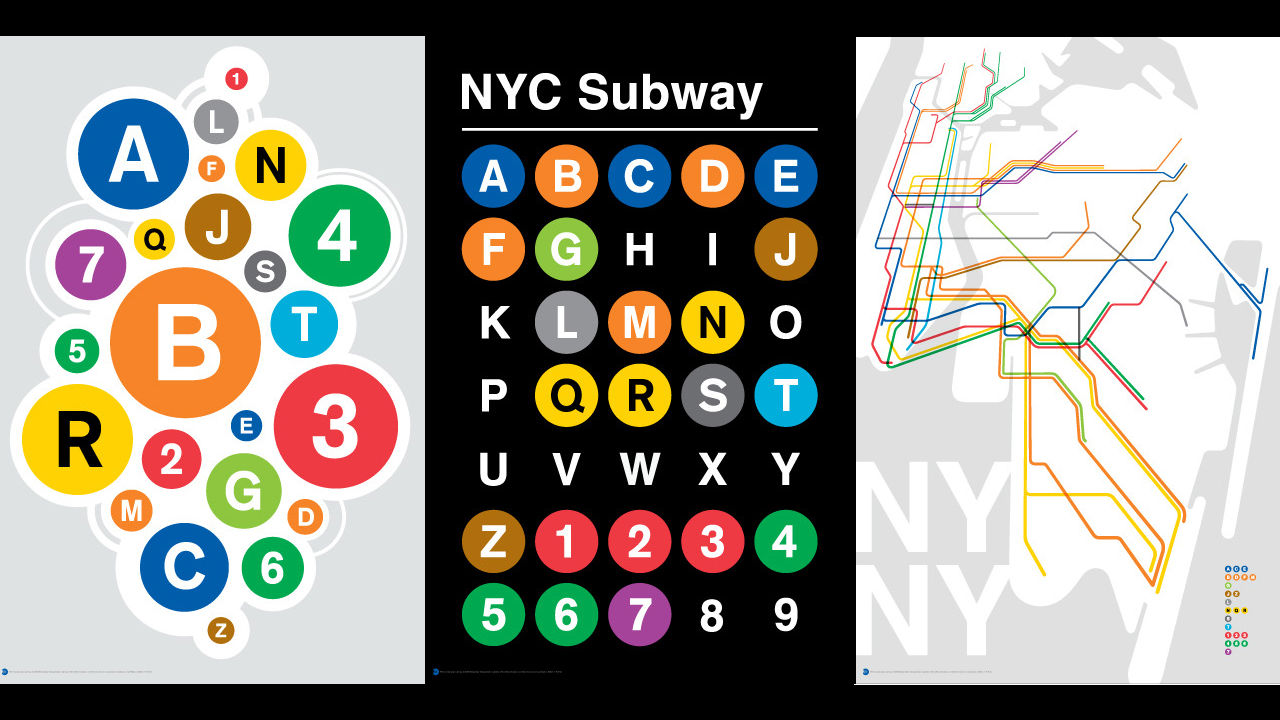
Though they don’t match the minimal beauty of Andrew Lynch’s brilliant single-line New York City Subway posters–which we posted about yesterday–these screenprinted wall-hangings inspired by our city’s transit system are pretty nice-looking as well. Designer Jody Williams, a New Yorker who’s been transplanted to Grand Rapids, Michigan, says the city still “inspires and influences” his […]