Tag: Infographics

Quite a few of these breakdowns of color in film have been popping up lately, but this one might be the nicest, even if its choice of films is already a little dated. Film Strip, created by Adam Pearce, gives you a chronological map of a film’s color palette, and when you scroll over the […]
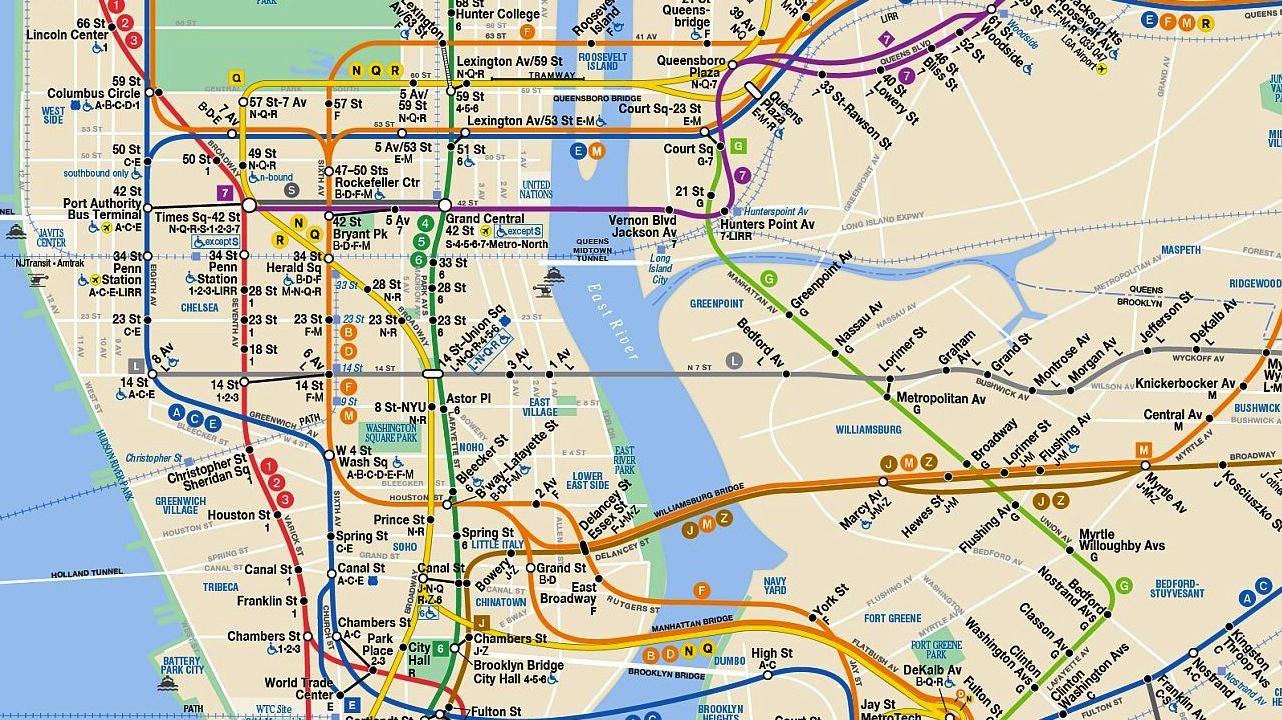
This ingenious infographic, created for the New Yorker by designer Larry Buchanan, illustrates New York City’s wealth disparities by plotting median household income against every subway stop in the city. Each train line is displayed individually, making it very easy to see the close relationship between geography and money. Witness the immense dropoff between Grand Street and […]
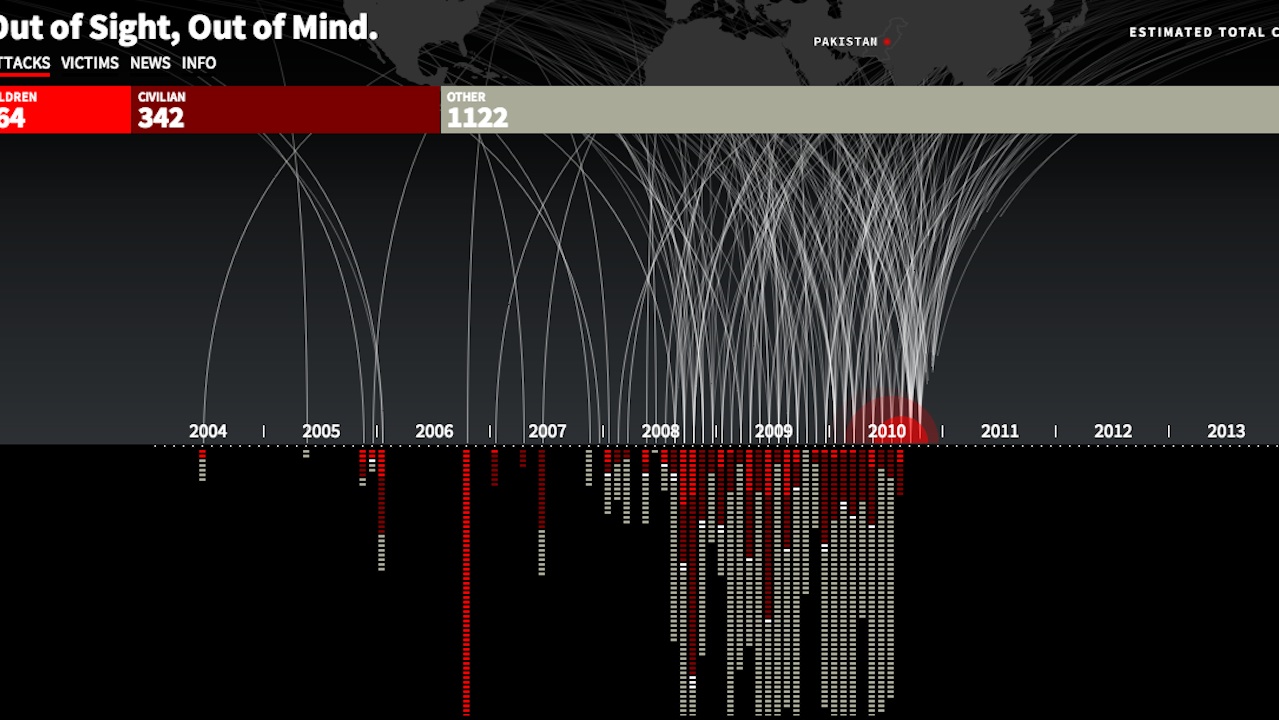
Created by the developers Pitch Interactive, this animated infographic plots every U.S. drone strike and all associated casualties. In just a few seconds, a flurry of strikes and deaths appear, beginning in 2004 and drastically upticking in 2008-2009, when Pervez Musharraf resigned as president of Pakistan and President Obama took office in the states. All […]
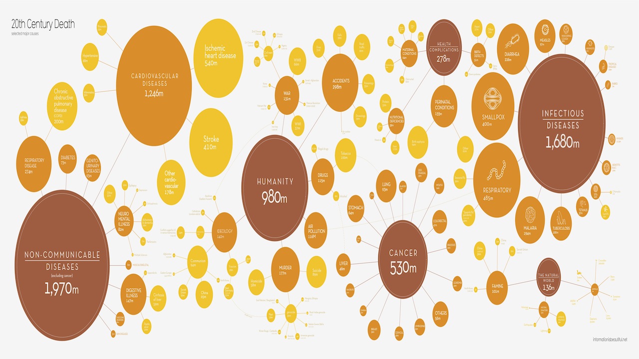
Did you ever want to know the biggest causes of death in the 20th century, but from an infographic complete with cheerful colors? Information Is Beautiful has you covered. With clean, peppy design, you’ll almost forget you’re looking at the statistics behind millions of deaths. View a full-size version here. […]

That big one in Siberia wasn’t the first meteorite to touch down on Earth. French journalist Jean Abbiateci and developer Pablo Navarro created the below animated visualization, which maps every meteorite fall from 1900 on onto one global map. And what do we learn? That lots of space rocks have touched down in the U.S. […]

To create these maps, data visualization specialist Olivier H. Beauchesne took to Wikipedia. Taking advantage of the site’s optional geotagging feature, which allows you to associate a specific latitude and longitude to any article–the New Museum’s entry could be linked to the Bowery, for example–Beauchesne first mapped every article on Wikipedia, then did searches for specific […]
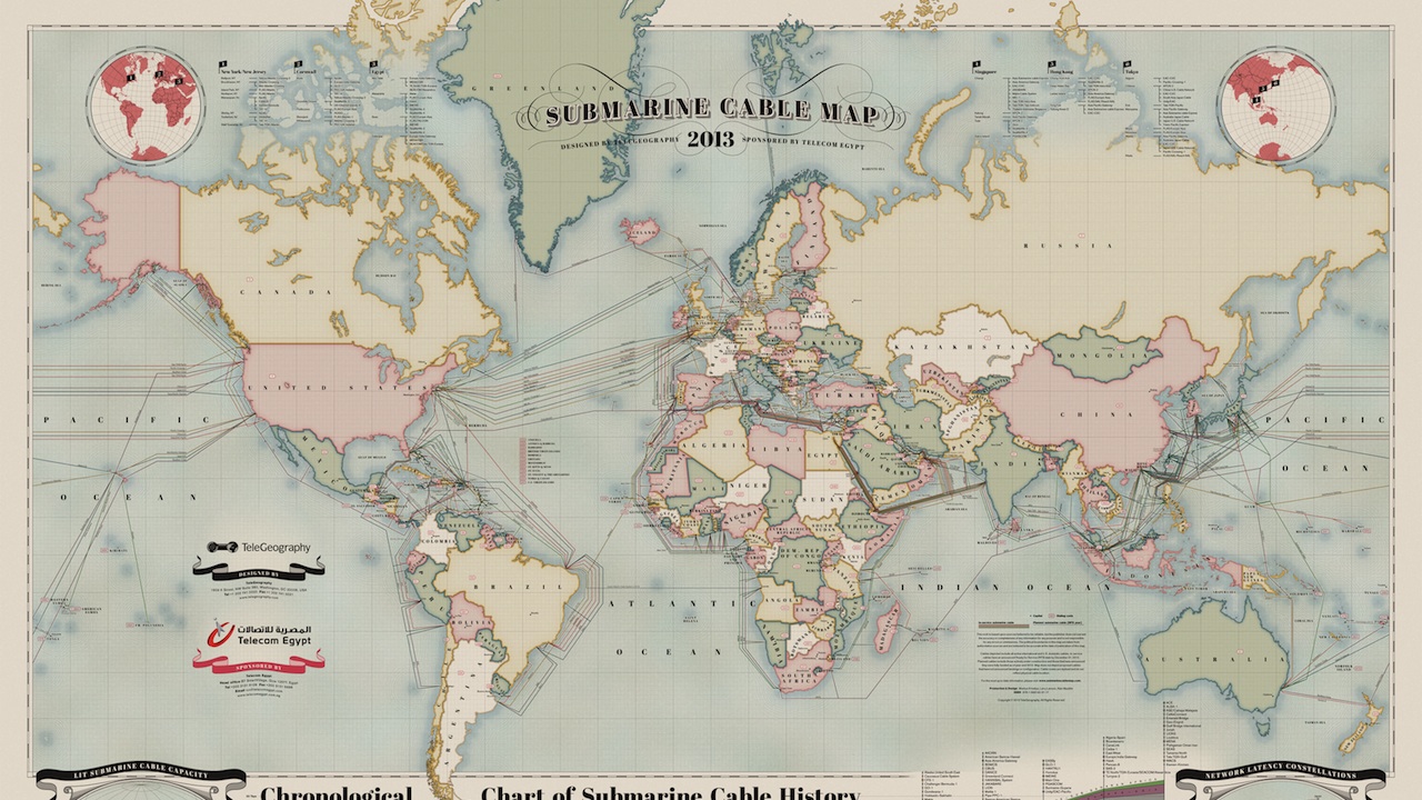
The internet is so omnipresent in most of our lives that it’s easy to forget about the vast physical network that supports it–which, among other things, is comprised of a staggering 550,000 miles of underground cabling. To show you exactly what that means, communications research firm TeleGeography and designer Markus Kristeya created the above beautifully […]

Just in time for Deadspin’s epic smackdown of Donald Trump, Hilary Sargent of Chartgirl created this wonderful inforgraphic documenting many of the man’s past media feuds. There’s Barbara Walters, who told Trump he was “making a fool” of himself over the birther nontroversy, Brian Williams, who said the man had “driven well past the last […]