Tag: Maps
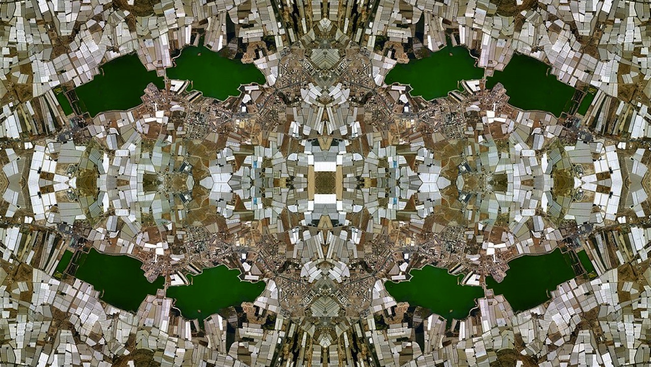
David Thomas Smith created these striking digital colleges by taking thousands of images from Google Maps, then stitching them together in Photoshop. And besides making the aerial view of your backyard look just like that totally trippy poster you had in college, the pieces have a more critical intent. By refracting the landscapes into repeating, kaleidoscopic […]
That big one in Siberia wasn’t the first meteorite to touch down on Earth. French journalist Jean Abbiateci and developer Pablo Navarro created the below animated visualization, which maps every meteorite fall from 1900 on onto one global map. And what do we learn? That lots of space rocks have touched down in the U.S. […]
Having already pinpointed the happiest intersection in Manhattan at 7th and 77th (near Hayden Planetarium), the applied mathematicians at Computational Story Lab are expanding their scope in an effort to map out the existential condition of the entire country. Unlike art cartographer Eric Fischer who used geotag data of tweets to map density of twitter […]
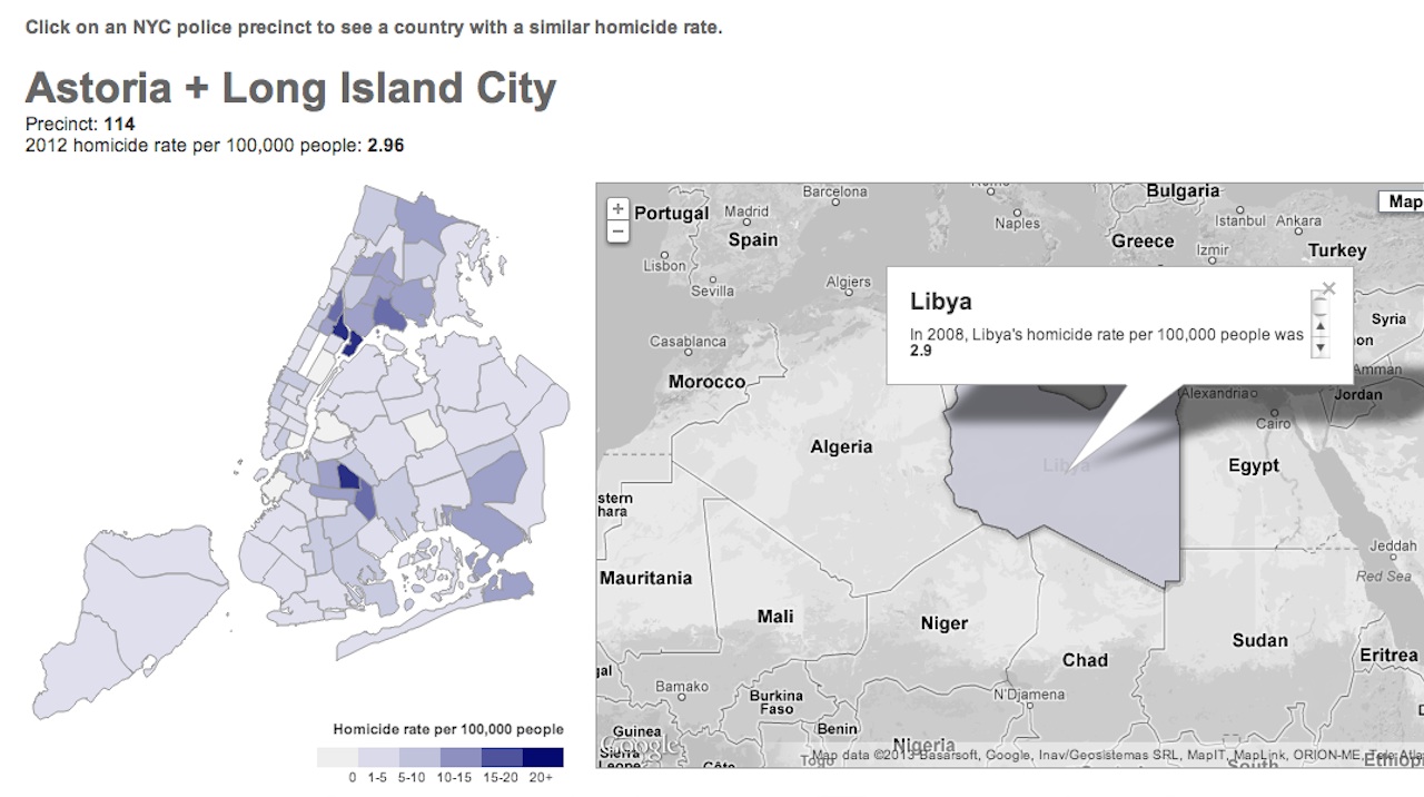
The New York World created this interactive map of New York City, which compares the 2012 homicide rate of each police precinct to that of a similar international country. Astoria/Long Island City, with its 2.96 homicides per 100,000 people, is like Libya; East Harlem, with its 25 homicides per 100,000 people, is like Brazil. My […]

To create these maps, data visualization specialist Olivier H. Beauchesne took to Wikipedia. Taking advantage of the site’s optional geotagging feature, which allows you to associate a specific latitude and longitude to any article–the New Museum’s entry could be linked to the Bowery, for example–Beauchesne first mapped every article on Wikipedia, then did searches for specific […]
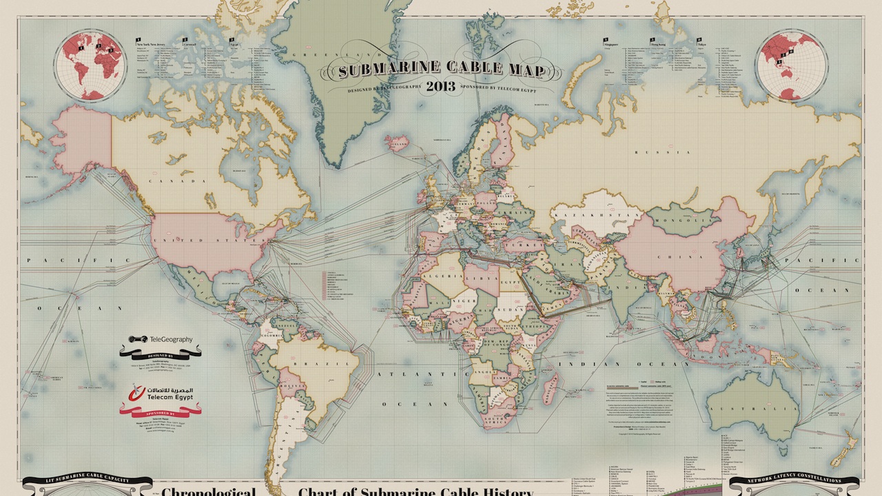
The internet is so omnipresent in most of our lives that it’s easy to forget about the vast physical network that supports it–which, among other things, is comprised of a staggering 550,000 miles of underground cabling. To show you exactly what that means, communications research firm TeleGeography and designer Markus Kristeya created the above beautifully […]
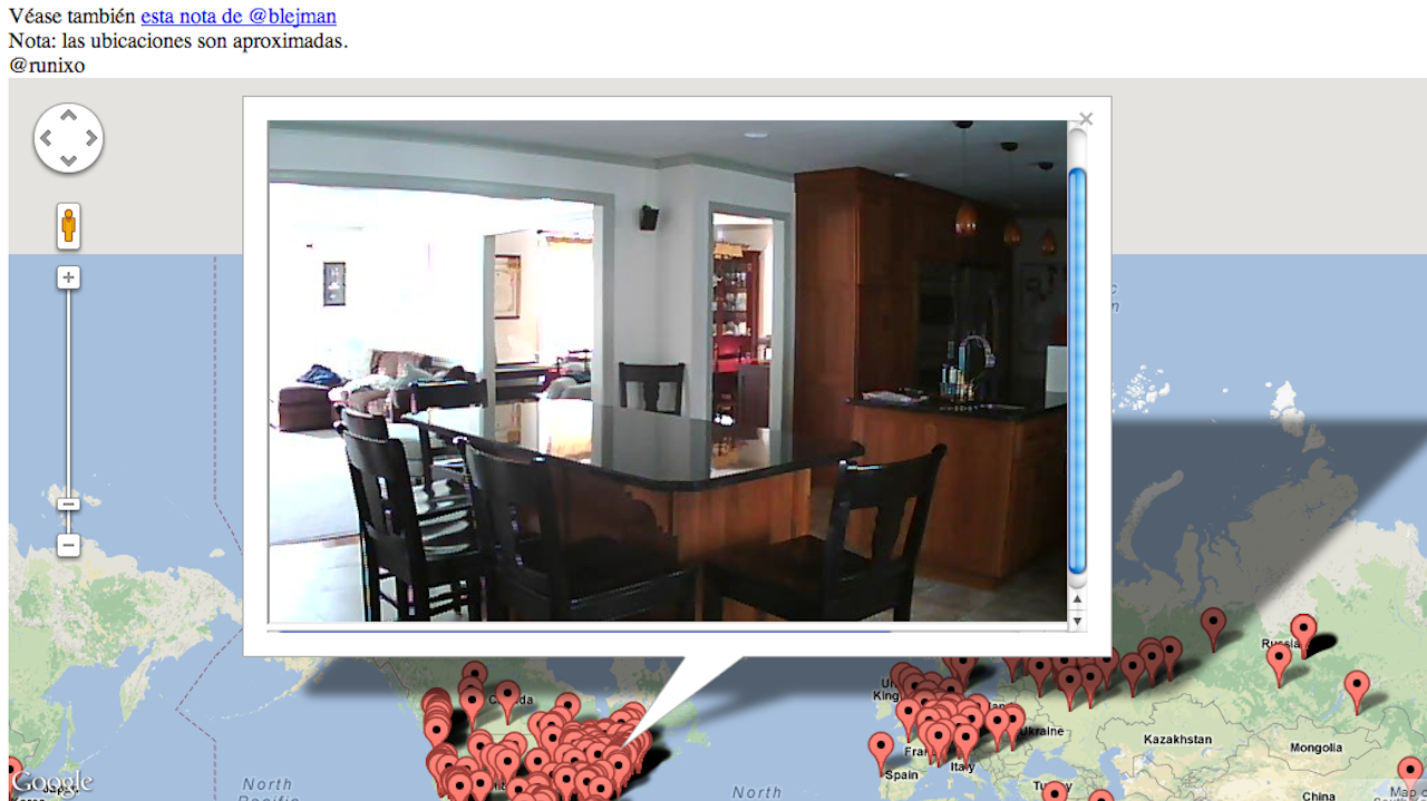
When 4chan exposed flaws in certain TRENDnet security systems that allowed hackers to snoop on private camera feeds last year, the whole process felt too wonky to be exploited by your average IRL citizen–unless your neighbor was a /b/tard or redditor, he probably wouldn’t be spying on you. A year later, TRENDnet has issued a […]
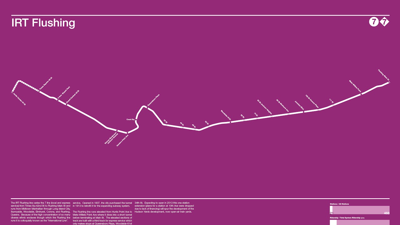
As designer Andrew Lynch points out, though traditional Subway maps are extraordinarily useful, in the strictest sense, many aren’t really maps at all: proportions are skewed in favor of readability, so that the distance between two stops on the map may not truly reflect their actual proximity. With a passion for accuracy and an eye […]
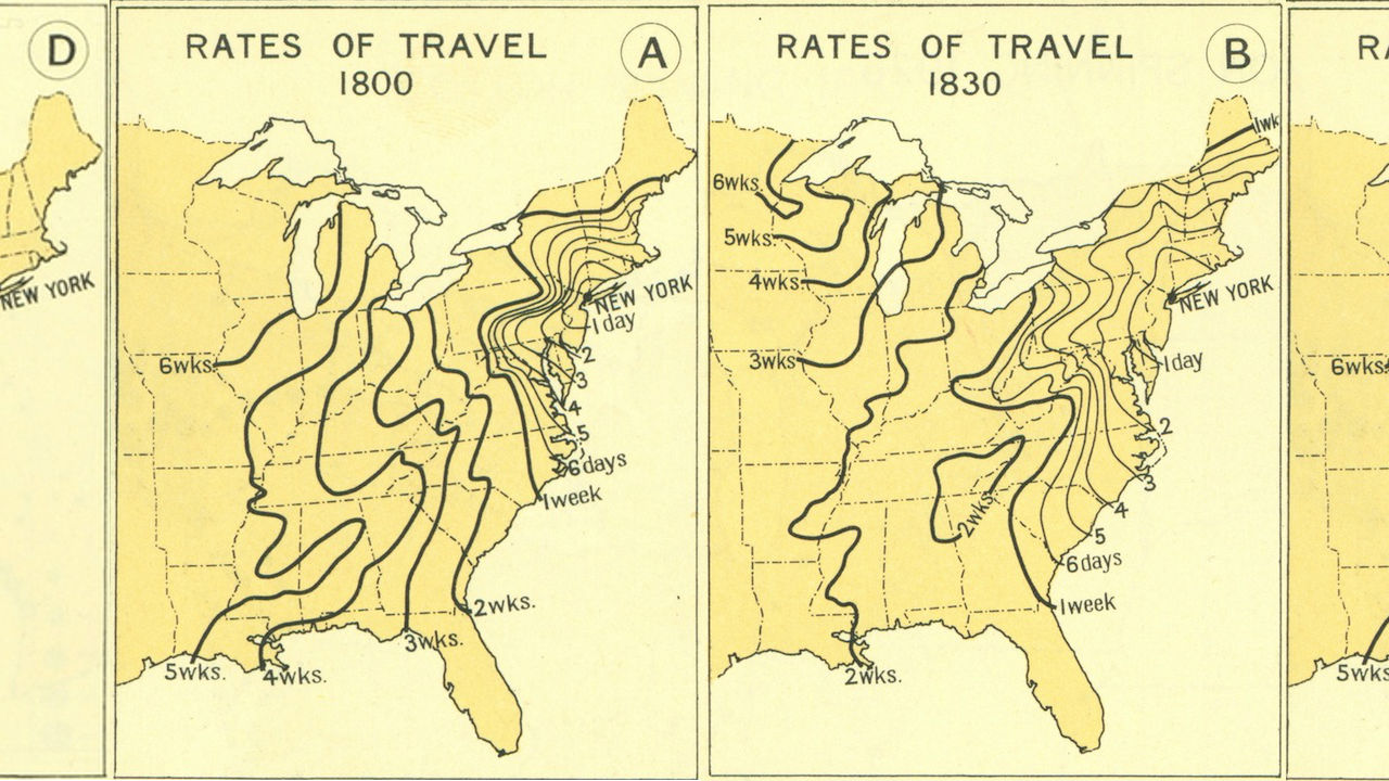
Ever wonder just how much more inconvenient transit was back in the days before airplanes and the interstate highway system? A set of maps unearthed by Mother Nature Network goes into detail. The maps, produced by the Atlas of the Historical Geography of the United States in 1932, use New York City as a starting point […]
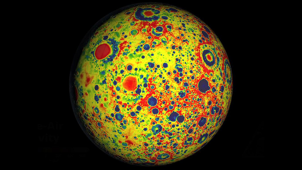
I know it’s unscience-like to gush over how trippy the Moon looks like in this visualisation of its gravitational field, measured by NASA’s Gravity Recovery and Interior Laboratory (GRAIL). I’ve been informed that only stoned teenagers giggle at the psychedelic visual coolness of fractals, so I can’t get too excited about this map of the most […]