Tag: Maps

We know that Russia is into Russian teen anal, but what about the States? Earlier last week, popular porn site Pornhub released user data chronicling some of the nation’s top porn search terms. Luckily, a Reddit user has organized all of this groundbreaking info by plugging it into a handy visual map, effectively letting all of us […]
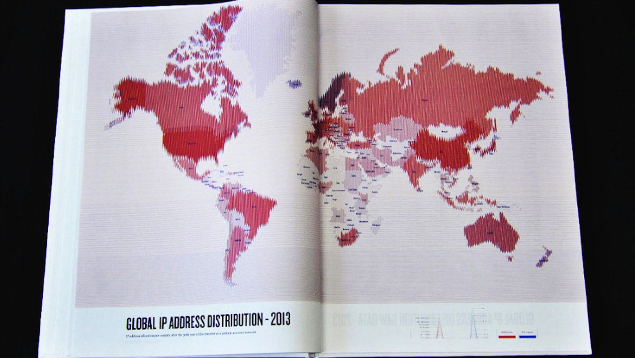
In an effort to map the world in a way that reflects the way we experience it in 2013, Israeli designer Dafna Aizenberg created the Atlas of the World Wide Web, a series of charts exploring things like IP address distribution, speed of internet connections, and popular search terms across the globe. Each beautiful design is meant to […]

To create the homespun map you see above, NYC-based artist Nobutaka Aozaki pretended to be a tourist. Clad in a cheesy baseball cap and toting a Century 21 bag, he walked around Manhattan, asking strangers to draw him directions. After talking to dozens, he assembled their bits of amateur cartography into From Here to There, the crowdsourced […]
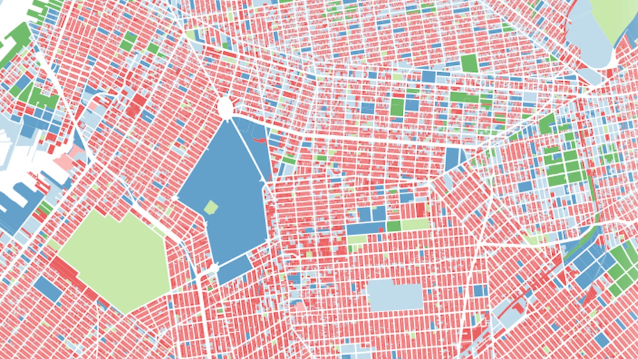
Recently, the city released a massive bundle of data about every lot of property in the five boroughs. Naturally, an intrepid data visualizer has already implemented it into a series of beautiful, informative interactive maps. Andrew Hill created the PLUTO Data Tour, which uses the data to look at things like the tallest walk-up in […]

Possibly more relevant to your life than the Starbucks map: a regularly updated cockroach map of NYC’s zip codes first launched in 2010, based on how many roaches are turned up by restaurant inspectors in a given week. This week, 10473, encompassing Clason Point, Shore Haven, and Castle Hill in the Bronx is the worst, and […]
Well, this is depressing. You know what’s depicted in the image above, don’t you? I’ll give you a minute. It’s New York City. Easy, right? That crowded, finger-like thing near the top is definitely Manhattan (check out Central Park in the middle if you had any doubts), and from there, it’s easy to infer that […]

Because it can be hard to juggle all the free stuff that’s happening on any given day in NYC, especially during the summer, Redditor lostfeeling made this searchable, interactive map of everything free and cheap in our city’s parks. Just set your date range and your preferred type of event and you’re off. Today, for example, […]
So, this thing is supposed to “explore the spatial structures of Flickr tags” to “generate temporal city level maps,” which, okay, fine, whatever–but really it’s just a nice way to see photos from NYC (and a bunch of other cities) laid out on a map based on where they were taken. Yes, there are fancy […]
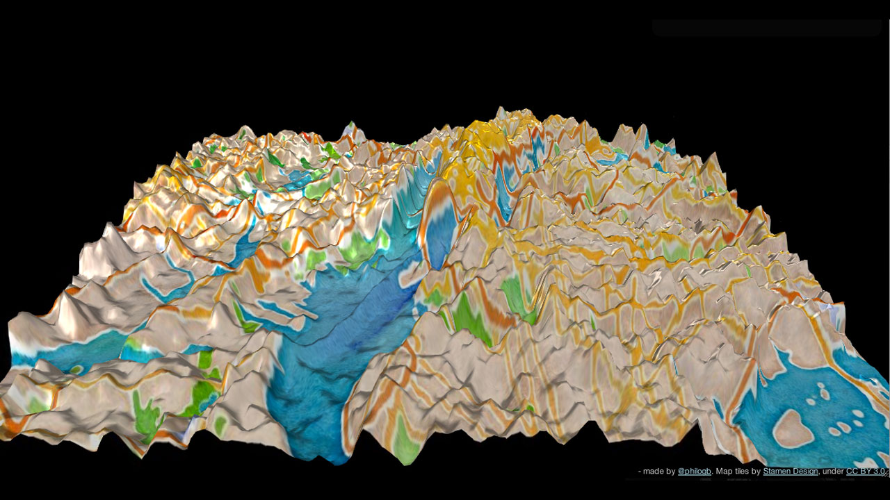
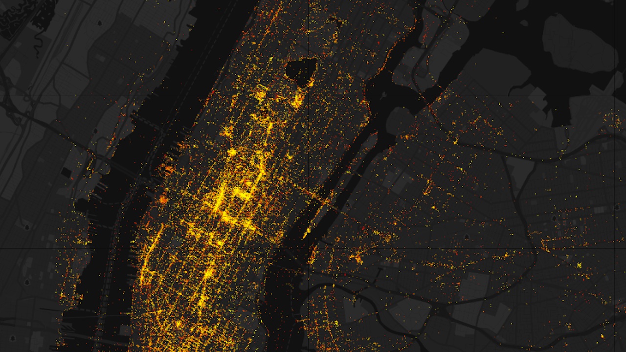
Elevation levels? Latitude? Who cares! Now you can learn the lay of the land based on Twitter activity. Andes is a topographical visualization of geo-located tweets and their frequencies — in New York City (above), San Francisco, and Istanbul. Created by data visualization scientist Nicholas Garcia Belmonte, the 3D-interactive maps depict Twitter usage as towering peaks — the […]
The New York Times has compiled this helpful crowd-sourced map of hundreds of Manhattan’s quietest places, for those times when you need to avoid the crushing noise of the city. For Manhattanites, there’s Inwood Hill Park, John Jay Park, and Randall’s Island, for Brooklynites, Valentino Pier, Cobble Hill Park, and Vinegar Hill. See them all here. (Photo: […]