Tag: Design
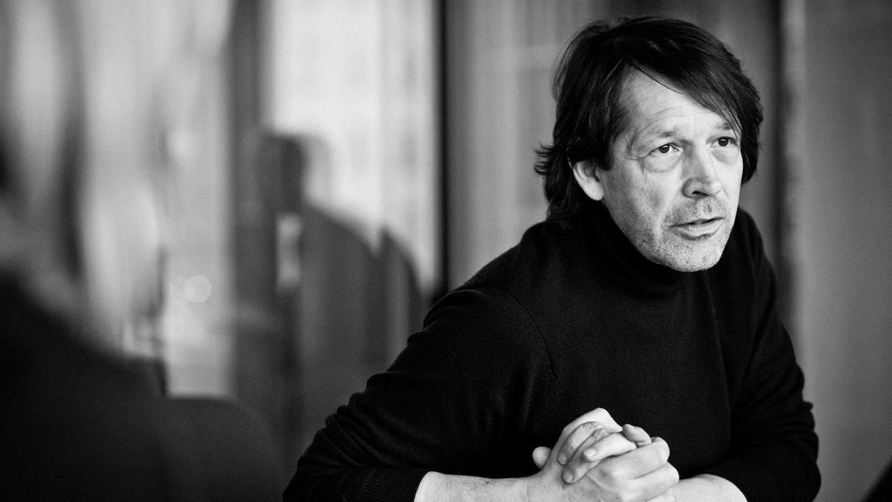
Yeezus wants a new logo, and, because he is a man of wealth and taste, he is going to the best: Peter Saville, the man who branded Joy Division, New Order, and Factory Records. According to Saville, who announced the partnership at the Global Design Forum in London this week, his working relationship with Kanye […]
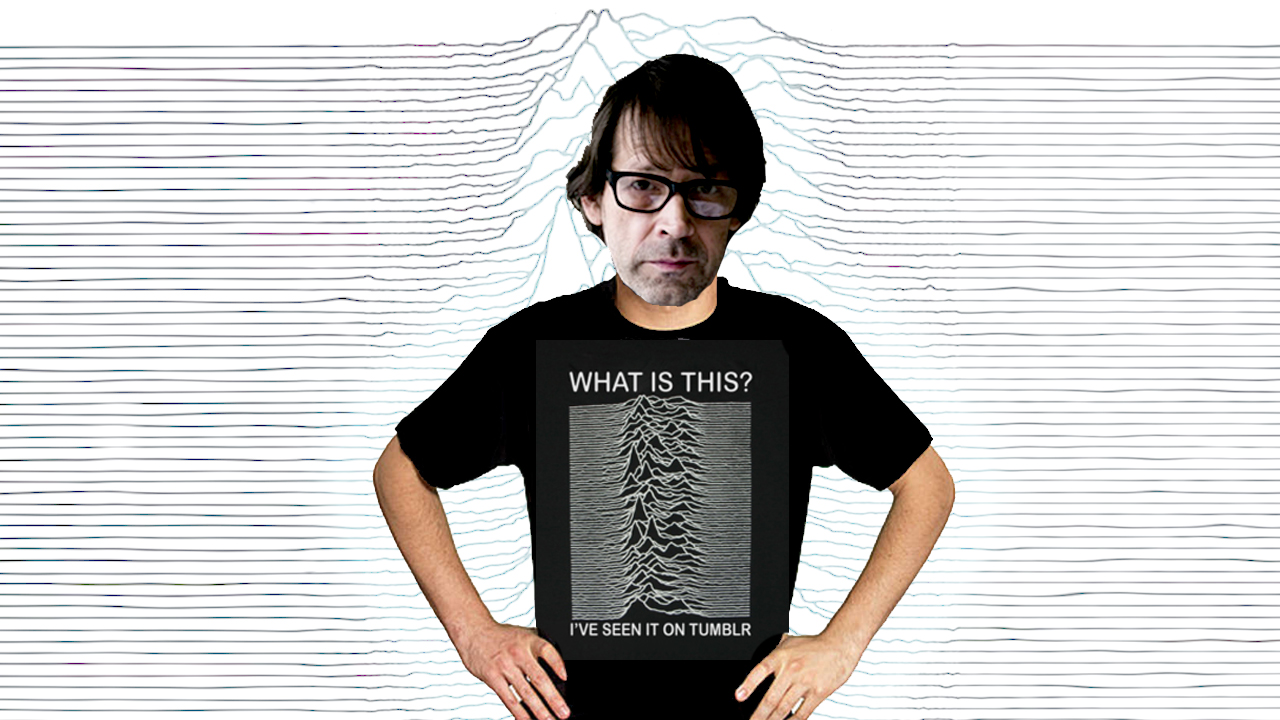
UK’s most famous graphic designer Peter Saville isn’t fazed by the never-ending throng of tributes, homages and rip-offs of that one most famous thing he did. In a recent interview with the Guardian, he refers to the time Disney tried to sell it as a Mickey Mouse silhouette a “the total car crash catalogue of […]
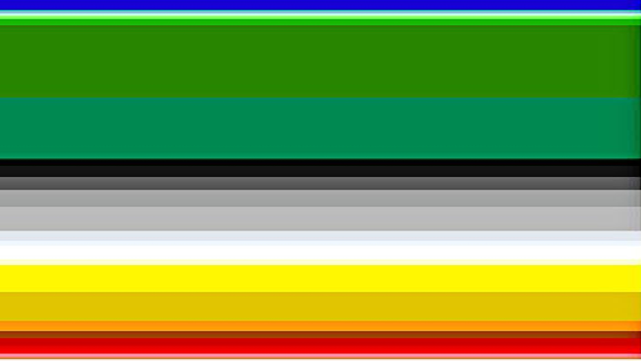
This is The Wizard of Oz, as told in color only, based on the frequency in which specific colors are either mentioned or alluded to within the text of the book. British artist Jaz Parkinson created this series of alternate book cover designs for Smithsonian because “interested in showing how the human mind can transform a word of text into […]
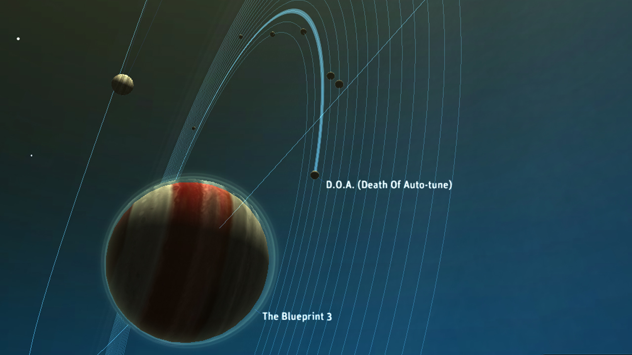
The unique iPad app Planetary has just been added to the Smithsonian’s Cooper-Hewitt, National Design Museum’s collection. The institution has gone one step further by acquiring the app’s source code as well. This is the first time the Smithsonian has attained a piece of code. The institution has also made this code available to everyone, in an attempt to preserve software as […]
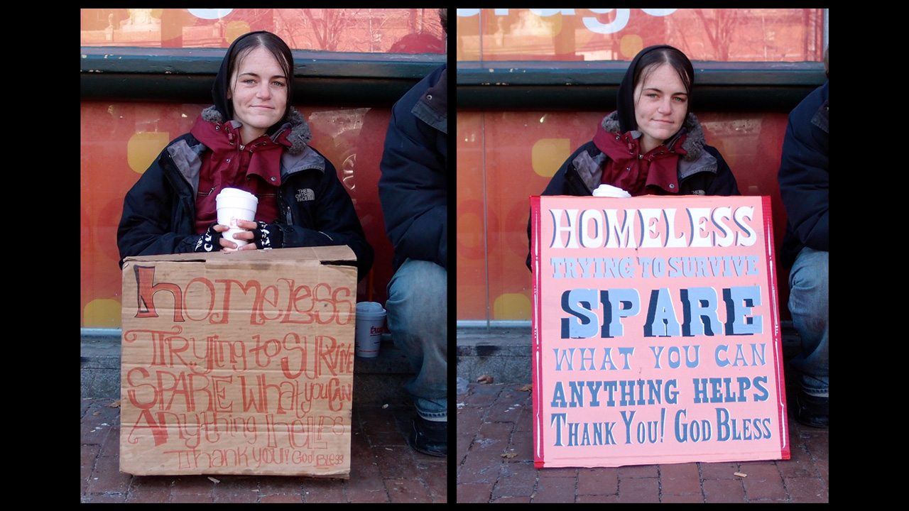
Although revamping signs for the homeless is not a novel idea, Kenji Nakayama and Christopher Hope’s ongoing project is effective. The Massachusetts-based artists remake these signs in their entirety, adding beautiful topography and catchy colors to the solicitations for charity. Paired with interviews and heart-wrenching quotes of life in the street, the project showcases the perks of a good presentation. […]
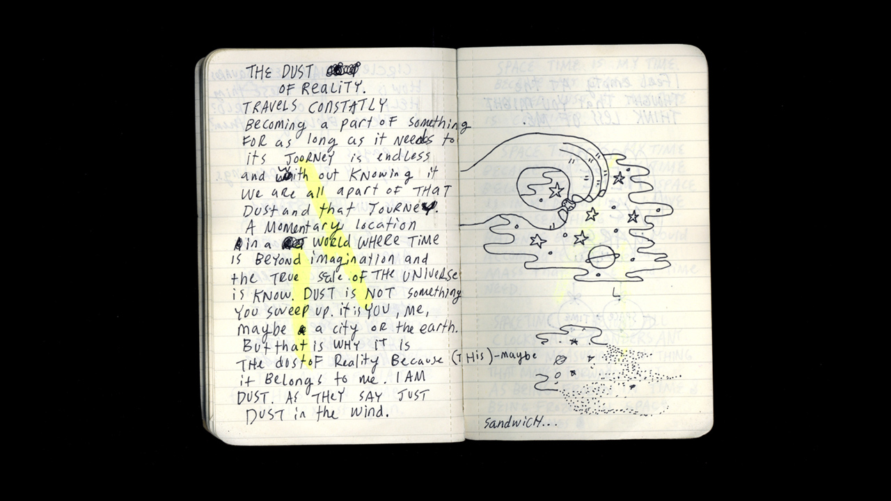
ANIMAL’s feature Artist’s Notebook asks artists to show us their original “idea sketch” next to a finished piece. This week, Brooklyn artist Mike Perry shows us his visual ideas for making the sculpture Oozing Sandwich of Time, and a few other related sketchbook pages. My process is a fluid, ever-growing way of existing. Oozing Sandwich of Time: Artist’s […]
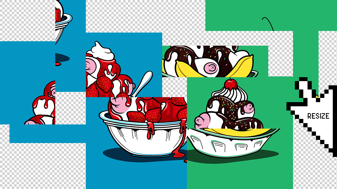
“Responsive Web Design” refers to the idea that a website should look as good on any one platform as it does on any other. See how, when you resize this window, the top image gets a little bigger and smaller with it? That’s responsive web design (RWD). It makes sense–you want your website to make […]
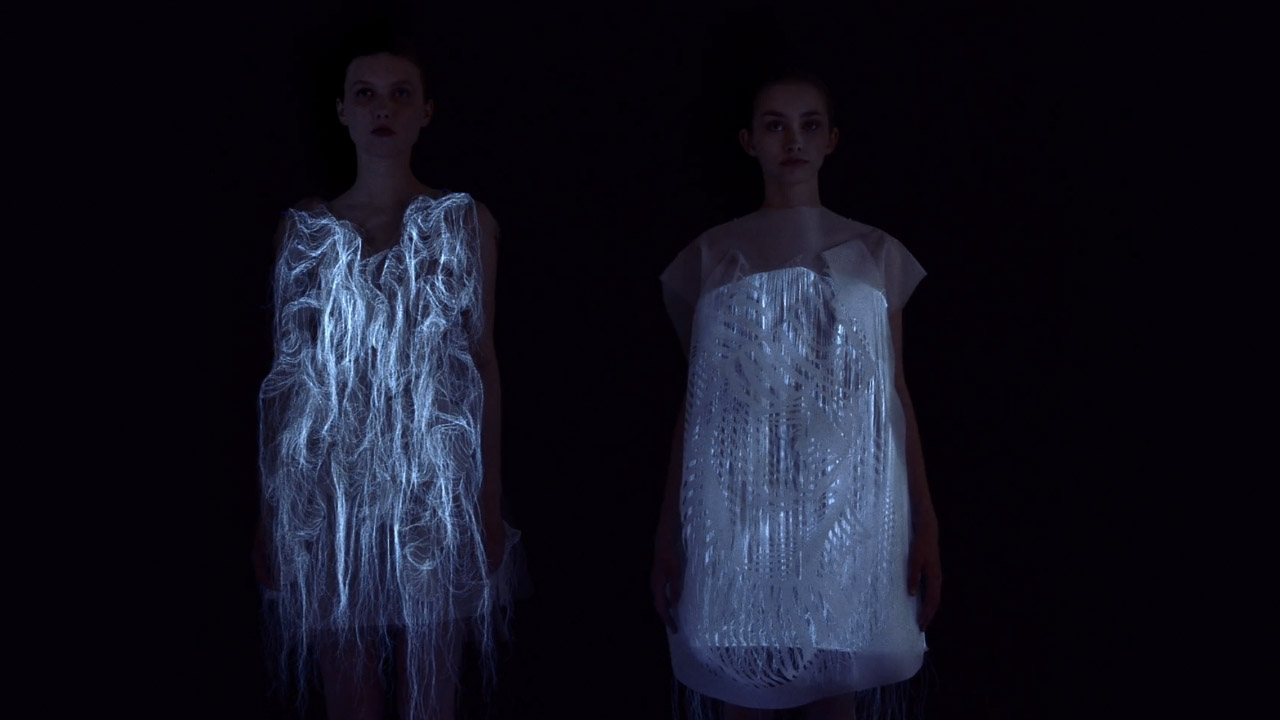
Fashion designer and UQAM professor Ying Gao has developed two dresses that illuminate themselves, but only while you’re paying attention to them. Inspired by an essay entitled “Esthétique de la disparition” (The aesthetic of disappearance) by Paul Virilio, the dresses work by way of including sections of photo-luminescent thread as well as an imbedded eye-tracking technology that is activated only by the […]
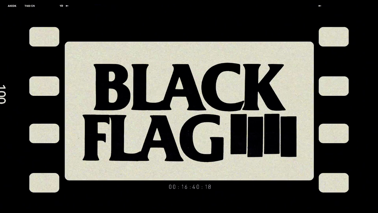
One of the most recognizable logos in punk rock history and, likely, the most prominently tattooed band logo finally got a documentary. MoCA TV — We see you! Good stuff! — shows the history behind its origins in Art of Punk + Black Flag. Black Flag’s iconic “four bar” logo, loosely based on the concept of a waving flag, as originally designed […]
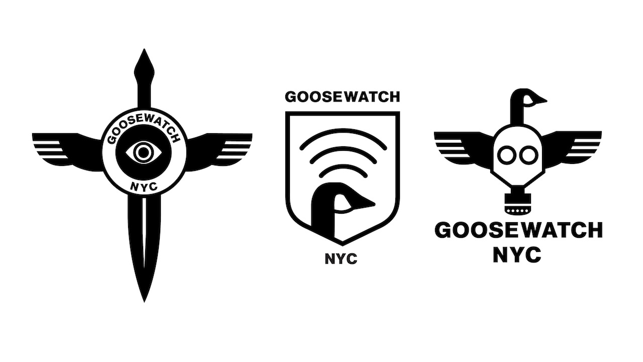
Every good organization deserves a good logo, so after ANIMAL profiled GooseWatch NYC earlier this week, we decided to do a little pro-bono, unsolicited design work for the volunteer group. In an attempt to curtail incidents of birds interfering with airplane flight, the City of New York and the USDA began slaughtering geese in NYC’s […]

