Tag: Maps
Yesterday, Redditor thehofstetter begat a passionate thread by presenting the above map for New York transplants in Los Angeles, allegedly, putting “Manhattan,” “Brooklyn,” “Upstate,” “Poor New Jersey” and “Rich New Jersey” over various spread our areas of Los Angeles County. It’s not very helpful or accurate. Someone who grew up in LA, i_am_food, presented this much-improved map… …but […]
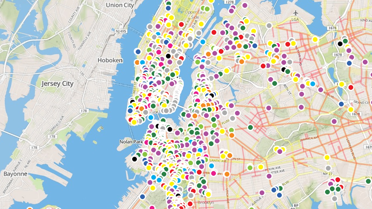
Yesterday, the de Blasio administration released an interactive map that lets New Yorkers publicly complain about the state of our streets. Everything from jaywalking to “cyclist behavior” to “long distance to cross” is reportable, and the map is already loaded with grievances. “Use this interactive map to share your experiences with city streets,” reads the […]

You’re in Manhattan and jonesing for a Venti Double Chocolaty Chip Frappuccino®. Quick, where’s the closest Starbucks? Chances are, it’s four blocks away or less. The data blogger Ben Wellington of I Quant NY plotted the location of every Starbucks on the island, then measured the distance between each Manhattan’s lots and the closest outpost of […]
Tens of thousands of people move to NYC ever year. Between July 2012 and July 2013, in fact, there were 61,000 new New Yorkers. Where are all those people coming from? According to data from Spokeo, an online database of phone numbers, they’re mostly from Connecticut and Washington, D.C. The company used area codes to […]
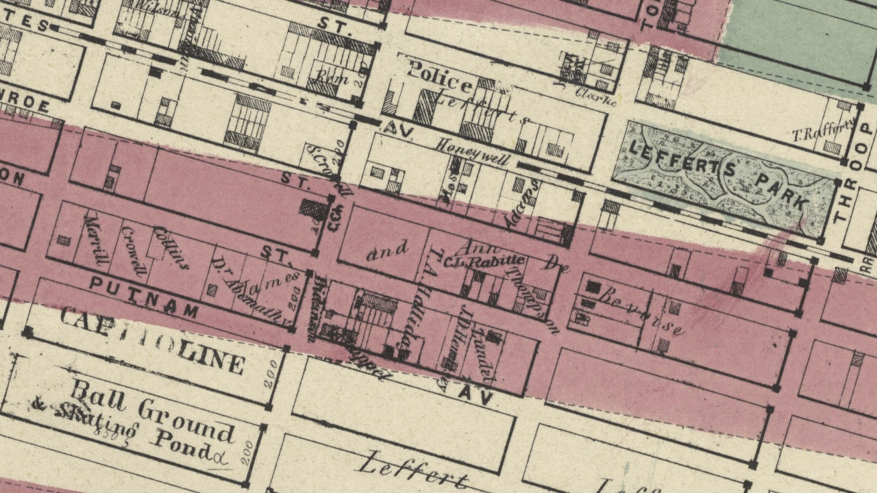
The New York Public Library just released an embarrassment of riches for cartography nerds everywhere: the institution’s collection of 20,000 vintage maps are now free to download and use in ridiculously high resolution. There’s plenty of vintage NYC goodness to peruse, and maps from other cities as well. The full-res section of this circa-1855 map […]
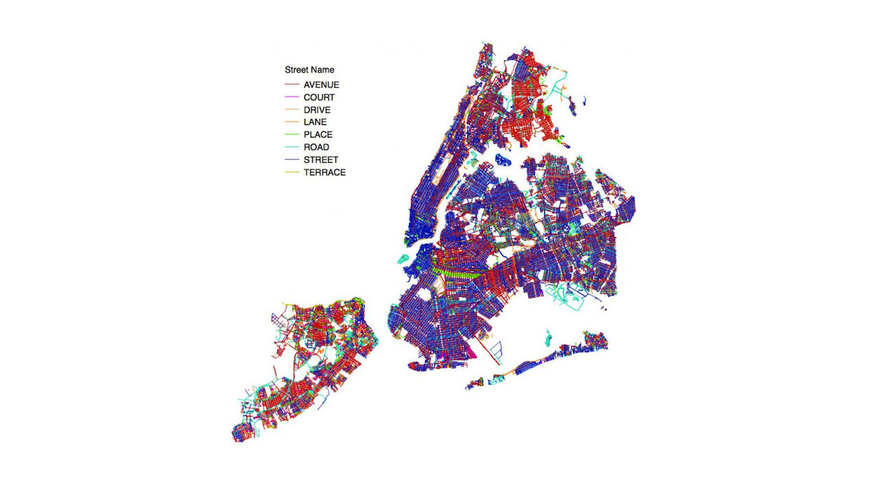
The colorful map above charts every street in New York City by its “street suffix”: if it’s a street, it’s blue; if it’s an avenue, it’s red; if it’s a place, it’s green; if it’s a road, it’s teal, and so on. It reveals a few obvious and not-so-obvious truths about the city’s patchwork of pavement. Of […]
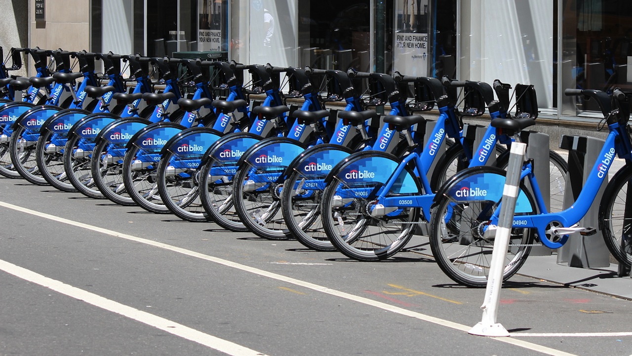
At first glance, the video below seems to show a thriving enterprise. Using Citi Bike’s openly available rider data, Jeff Ferzoco and Sarah Kaufman of NYU’s Rudin Center visualized two days in the life of the cash-strapped bike share program: over September 17 and 18 — two 60-degree, non-rainy days — we see 75,000 trips happening […]
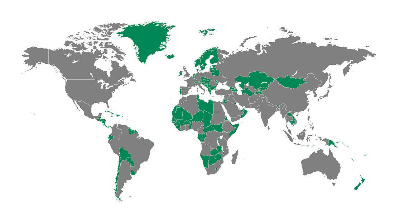
Redditor dakisking created the above map, which charts the nations with a smaller population than the New York metro area (including Long Island and parts of Jersey, Connecticut, and the Hudson Valley). Those areas, together with the five boroughs, make for 19.9 million people in total, and a surprising number of countries don’t measure up. I’m […]
Digg and Pornhub created this interactive porn infographic, which plots the favorite XXX subgenres of several major U.S. cities. What do we learn? The most popular search term across the country is “massage,” which seems pretty weird. Also, people really like Lisa Ann (aka Sarah “Paylin”). City-by-city, the results skew towards national trends, with stuff […]

Hot on the heels of the Bob Dylan map that dropped last year, here’s a Tom Waits map, marking the mentioned in the majestic weirdo’s work. New York gets a lot of love, with shout-outs in “Clap Hands,” “Fish in the Jailhouse,” “Downtown Train,” and of course, “Coney Island Baby,” among others. A quick perusal reveals […]