Tag: Maps
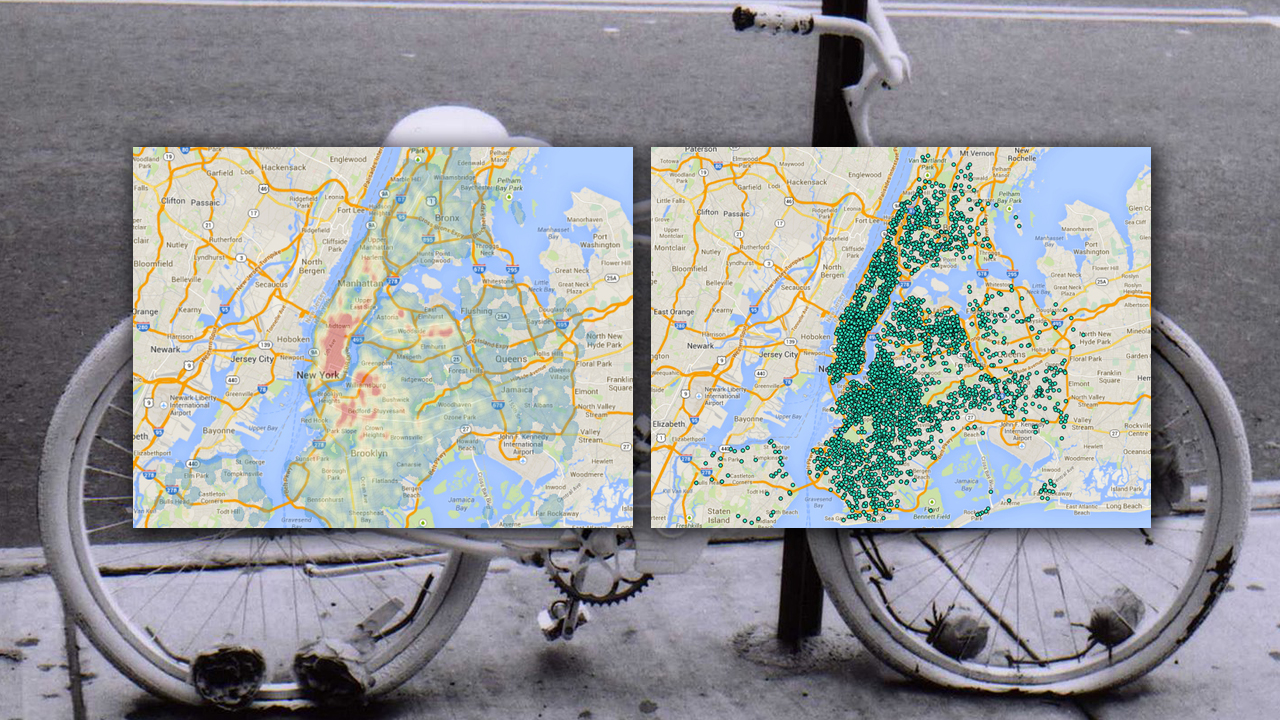
There were 3,800 cyclist injuries reported by the police in 2013. Open data enthusiast Ben Wellington helpfully mapped the data. Each dot on the top right map is a (recorded) accident and the heat map on the top left reveals problem areas like Williamsburg and the entirety of the East Side of Lower Manhattan. He also reviewed the data to map […]
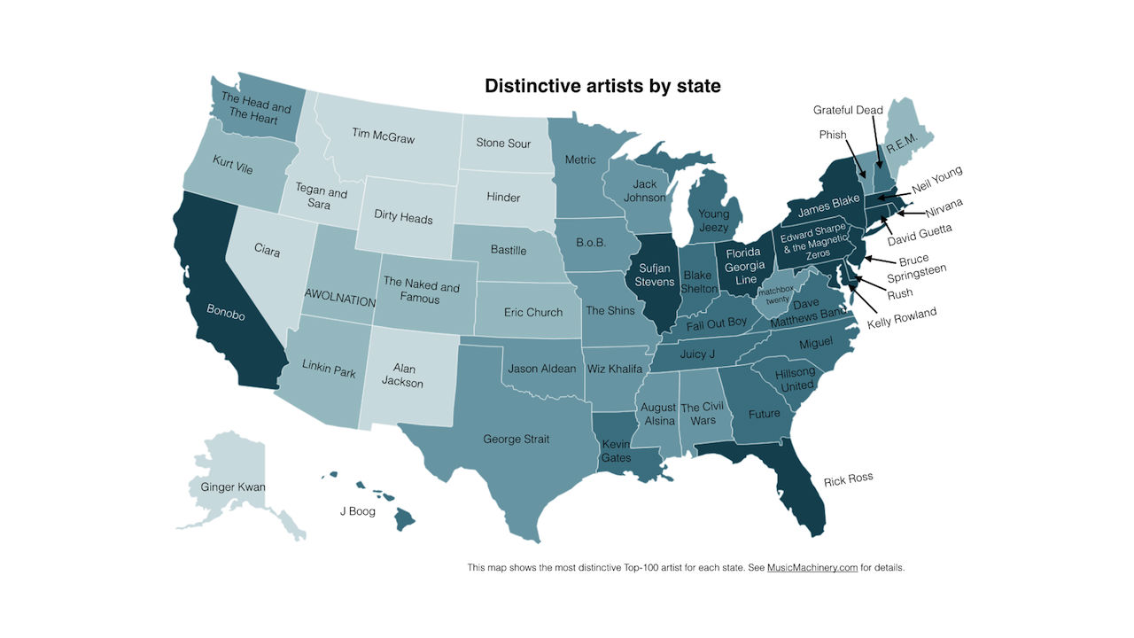
On the map above, which shows the most distinctive artist in each of the 50 states listening preferences according to Spotify, there are a few surprises. What makes Ciara so popular in Nevada, for instance, and why is Delaware so hot on Rush? Of course, there are satisfyingly predictable states as well, from New Jersey’s […]
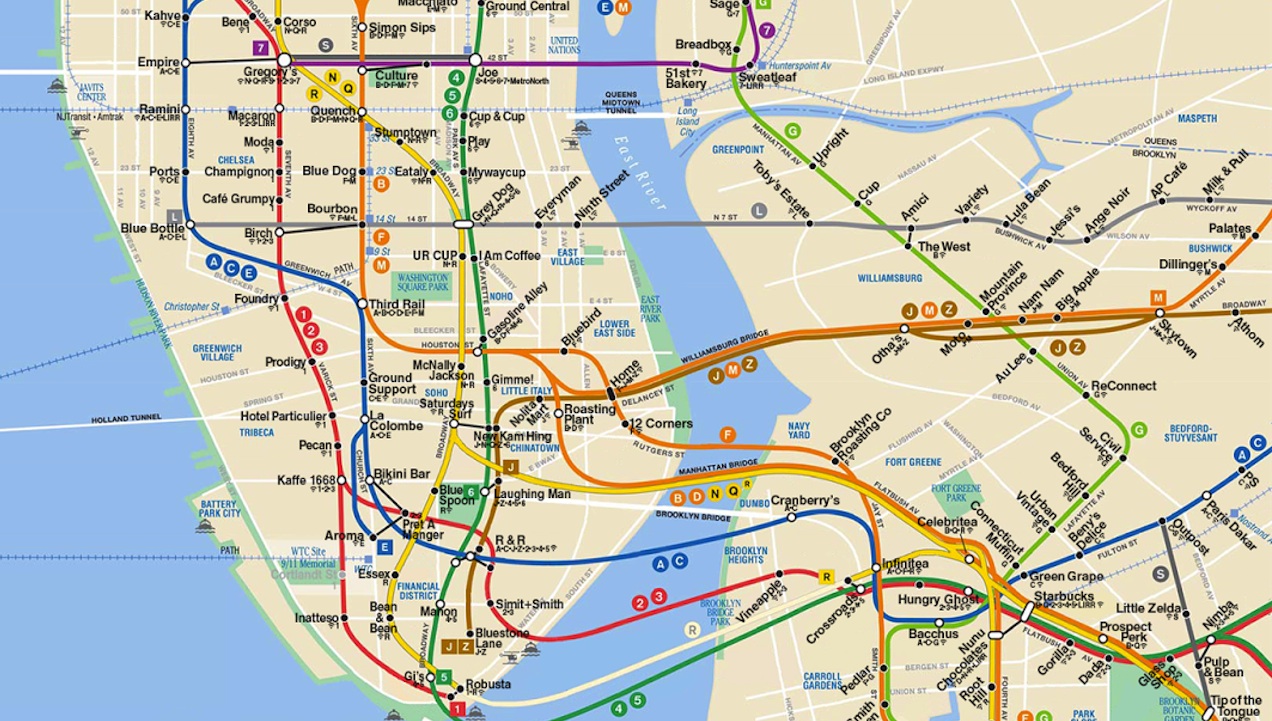
Last week, we showed you this map of Manhattan’s best coffee, organized by subway stop. It’s a useful resource, but those who live and work in the outer boroughs were out of luck until this week. Thankfully, Butterfruit Labs updated its map today to include western Queens and northwest Brooklyn. Those of us who live […]
Well, this is handy, isn’t it? Butterfruit Labs created this Manhattan subway map with the stop names subbed out for the area’s best coffee shop. 14th Street on the A/C/E becomes Blue Bottle, Spring Street on the 6 becomes Gimme! Coffee, et cetera. Without the names of stops to orient you it takes a bit […]
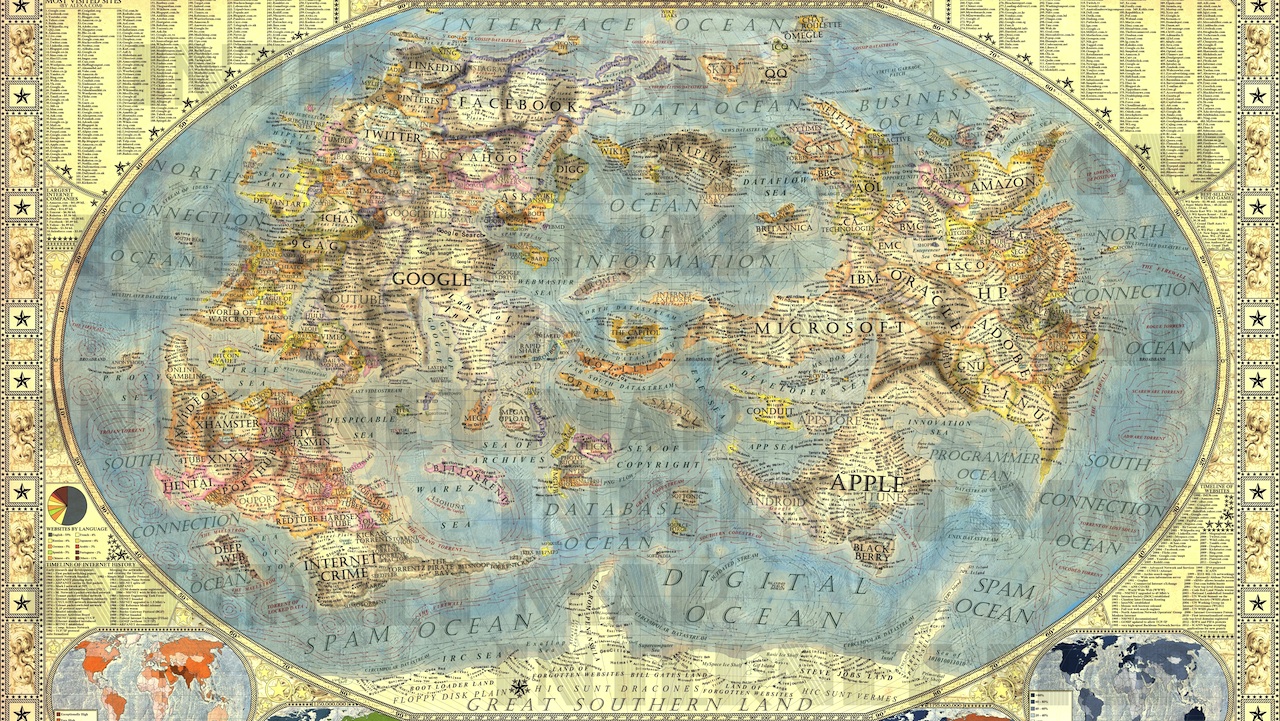
This astonishingly detailed old-timey “map of the internet” comes from Martin Vargic, a designer in Slovakia. There are nations of Facebook and Twitter, Apple and Google, Microsoft and Wikipedia. Gawker media gets its own cluster of countries — the capital is “Denton,” natch — and there’s a region full of porn and torrenting sites as […]
New York is expensive, New Jersey is bad, Maine is white, Louisiana is racist. Pennsylvania, for some reason, is haunted. These are the stereotypes put forth by Google’s autocomplete feature when you enter “Why is [xyz state] so…” The map below was created by @Amazing_Maps. Seriously, though: why is Nebraska so boring? […]
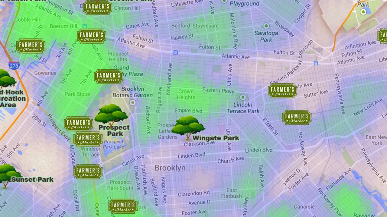
Last week, apartment-finding company Rentenna shared their NYC Green Heatmap for Manhattan, a simple map highlighting farmers markets, city parks and all other things green. Unfortunately, they left a few important things out, like the other boroughs. Seeing as the median rental prices in Brooklyn are have caught up with those across the river, the company […]
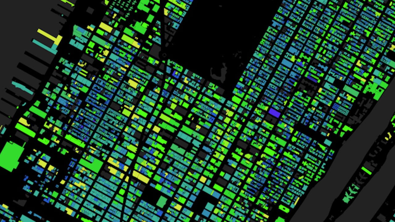
Here’s a beautiful map of most of NYC’s buildings, with age represented as color. Pink is on the early end of the spectrum, with buildings dating back to the 1830s, and yellow mark’s the city’s most recently-constructed buildings, with everything in between in shades of purple, blue, and green. Go and mess around a little […]
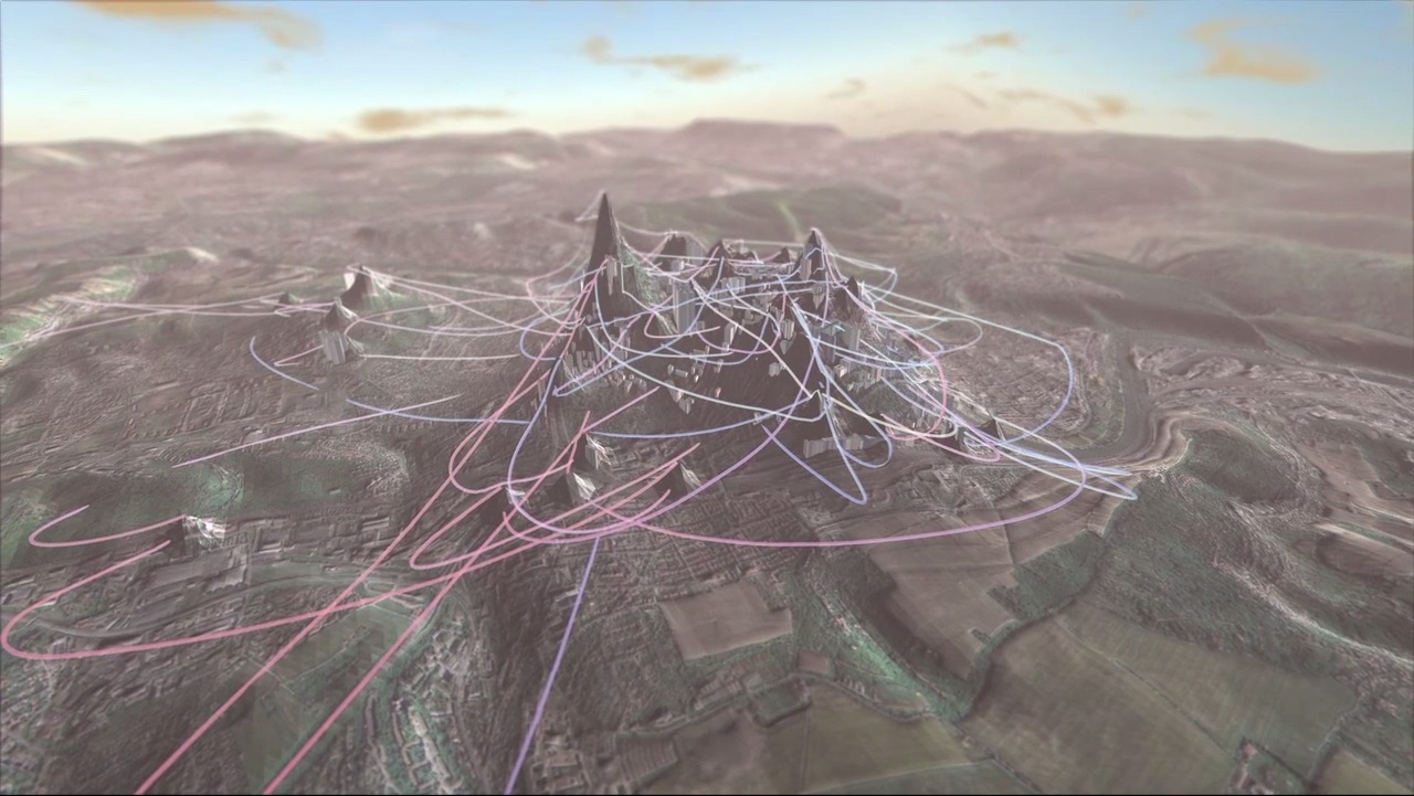
Generating Utopia, by German developer Stefan Wagner, takes Foursquare location data as input, then maps your most-visited (or most-broadcasted, to be precise) locations onto the topography of an area. It’s a bit like these topographical maps of NYC’s wealth, but way prettier and with money swapped out for total oversharing. Wagner had this to say about […]
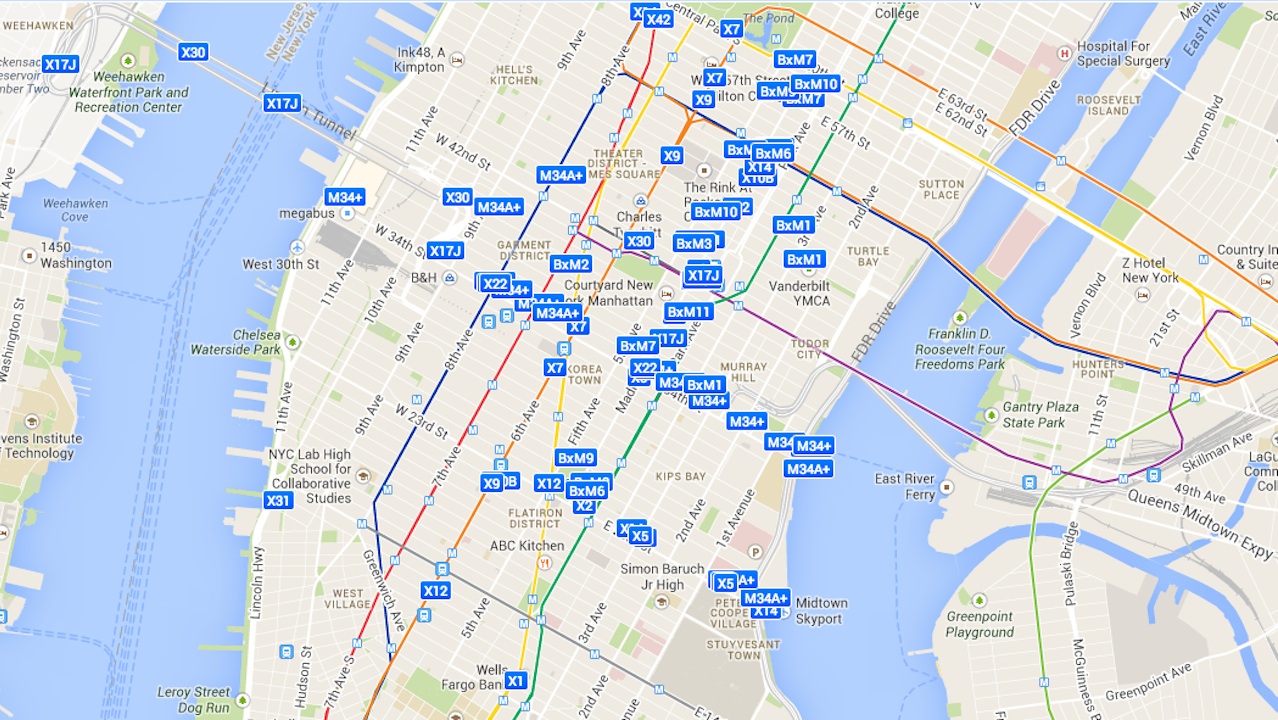
If you’re traveling through Manhattan, the Bronx, Staten Island or certain parts of western Brooklyn, the MTA’s Bus Time data is an invaluable tool. Sure, you can always just check the schedule to see when a bus is supposed to arrive, but Bus Time tracks where the buses actually are, predicting when one will arrive at your stop down […]